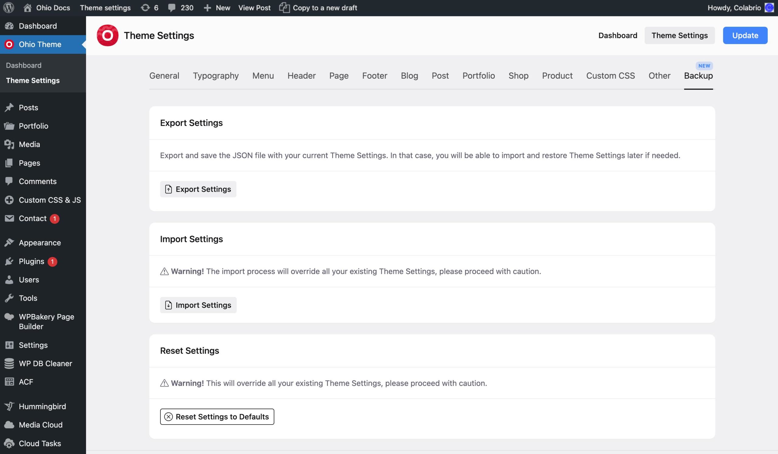
The Theme Settings panel contains 14 menu sections. And we’ll briefly explain what you can do in each of these tabs.
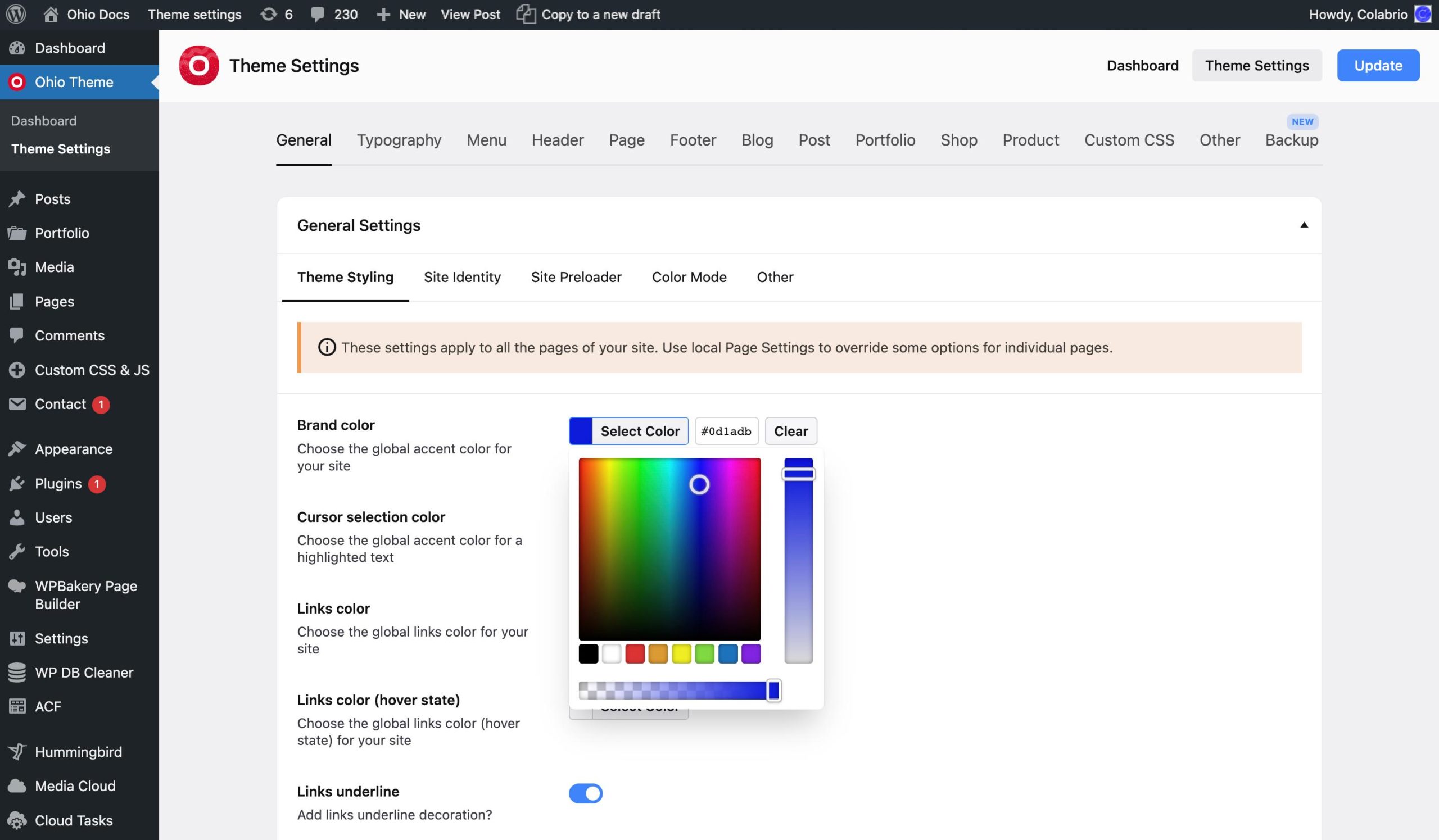
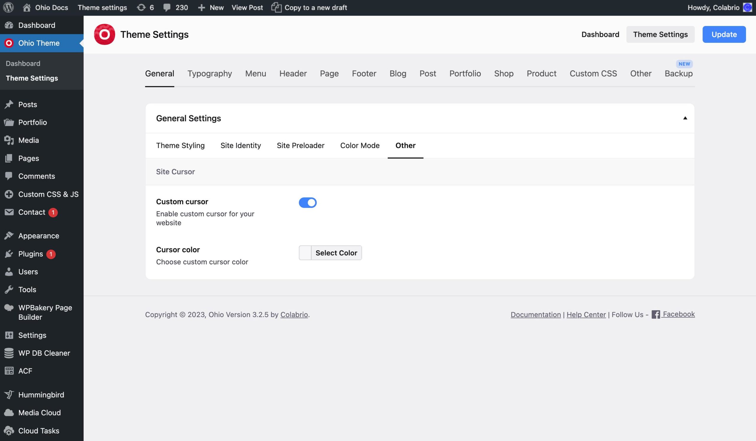
This tab contains tabs such as Theme Styling, Site Identity, Site Preloader, Color Mode, and Other.
The Theme Styling tab allows you to set the brand color, cursor selection color, the default color for links, borders, and button colors. Also, there’re options to enable/disable links underline and rounded button animation effects.
These are basically handy shortcuts for all of your site’s elements that will set the color you choose here unless you set the color explicitly when editing your page/element.
The Site Identity tab allows you to upload a custom logo image that will be used site-wide or use a regular text logo.
The logo can be uploaded in two variants (light and dark) and you can choose the default one. This is very helpful in case you enable a color mode switcher or have pages with different backgrounds and are using a transparent header. It makes you available to choose the logo which looks the best for each of your pages individually.

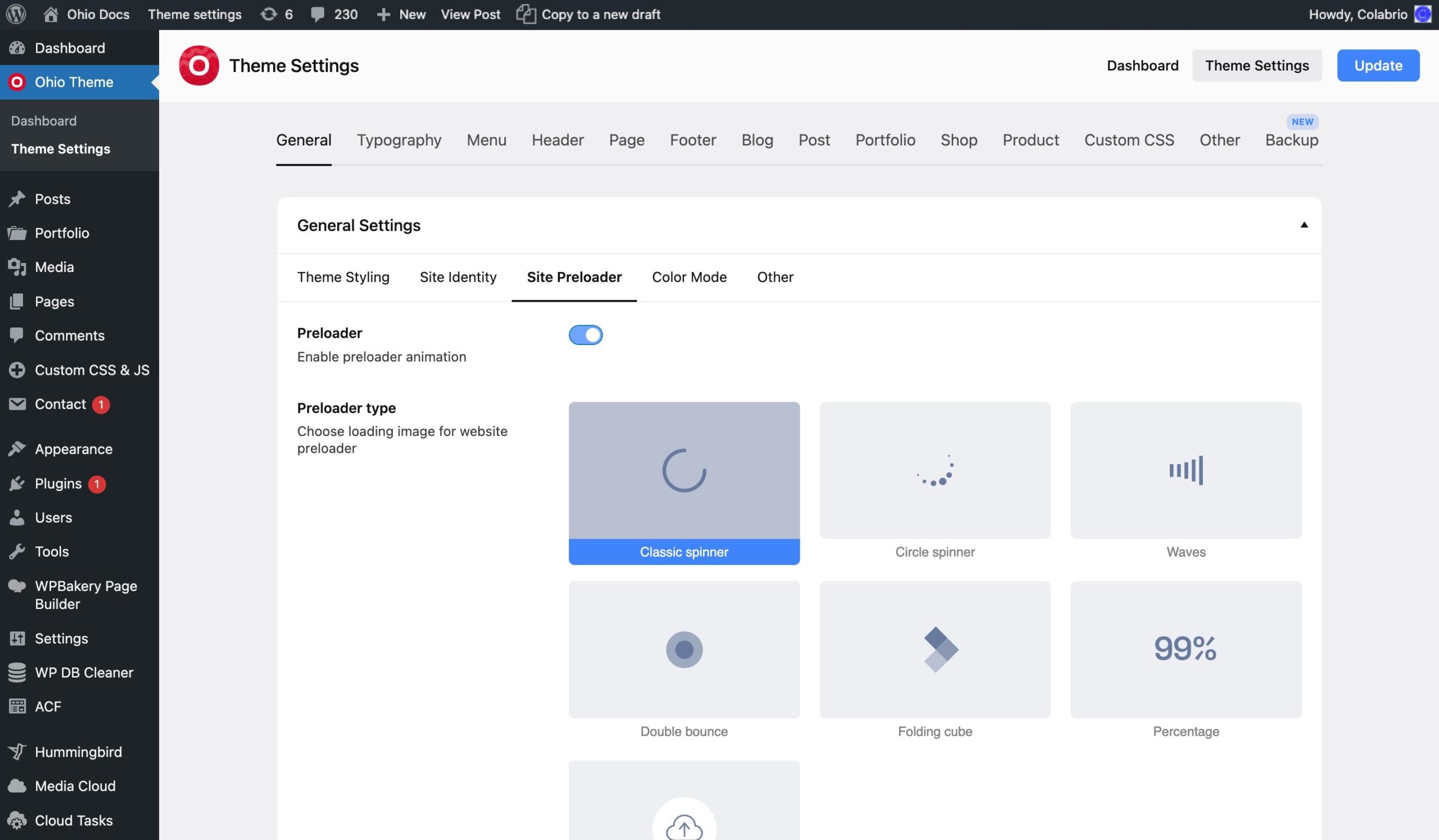
The Site Preloader tab allows you to disable/enable and set the style of your preloader (the animation you see when visiting a site using Ohio when it has not been loaded yet) including the color and type.
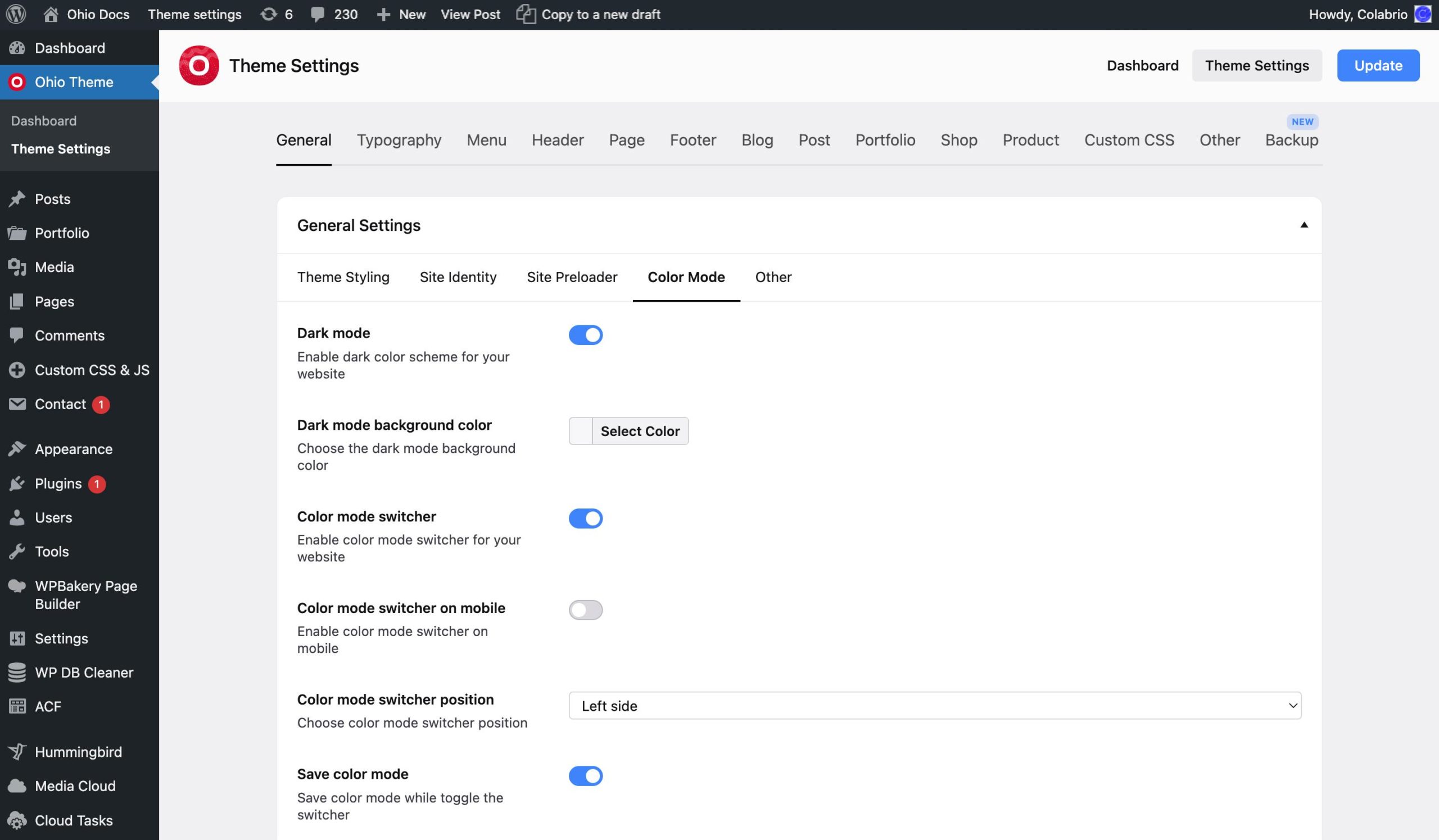
The Color Mode tab allows you to enable/disable and set up the Dark mode for your website. Also, there’s an option to enable/disable a color mode switcher, that allows choosing from Light or Dark color mode directly on your website.
The Other tab allows you to enable/disable and set the color for the custom cursor feature.
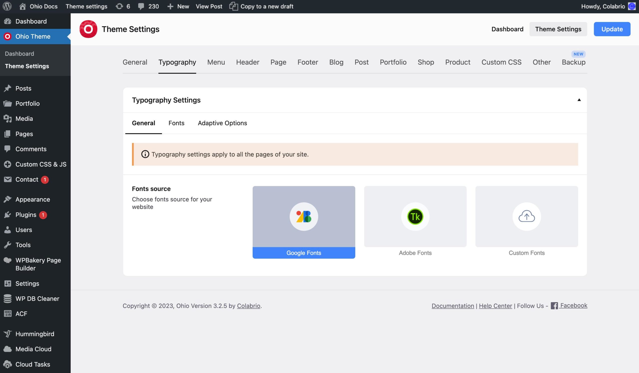
This tab contains tabs such as General, Fonts, and Adaptive Options.
The General tab allows you to choose font sources for your site from Google Fonts (that are used by default), Adobe Fonts, and Custom (self-hosted) font types.
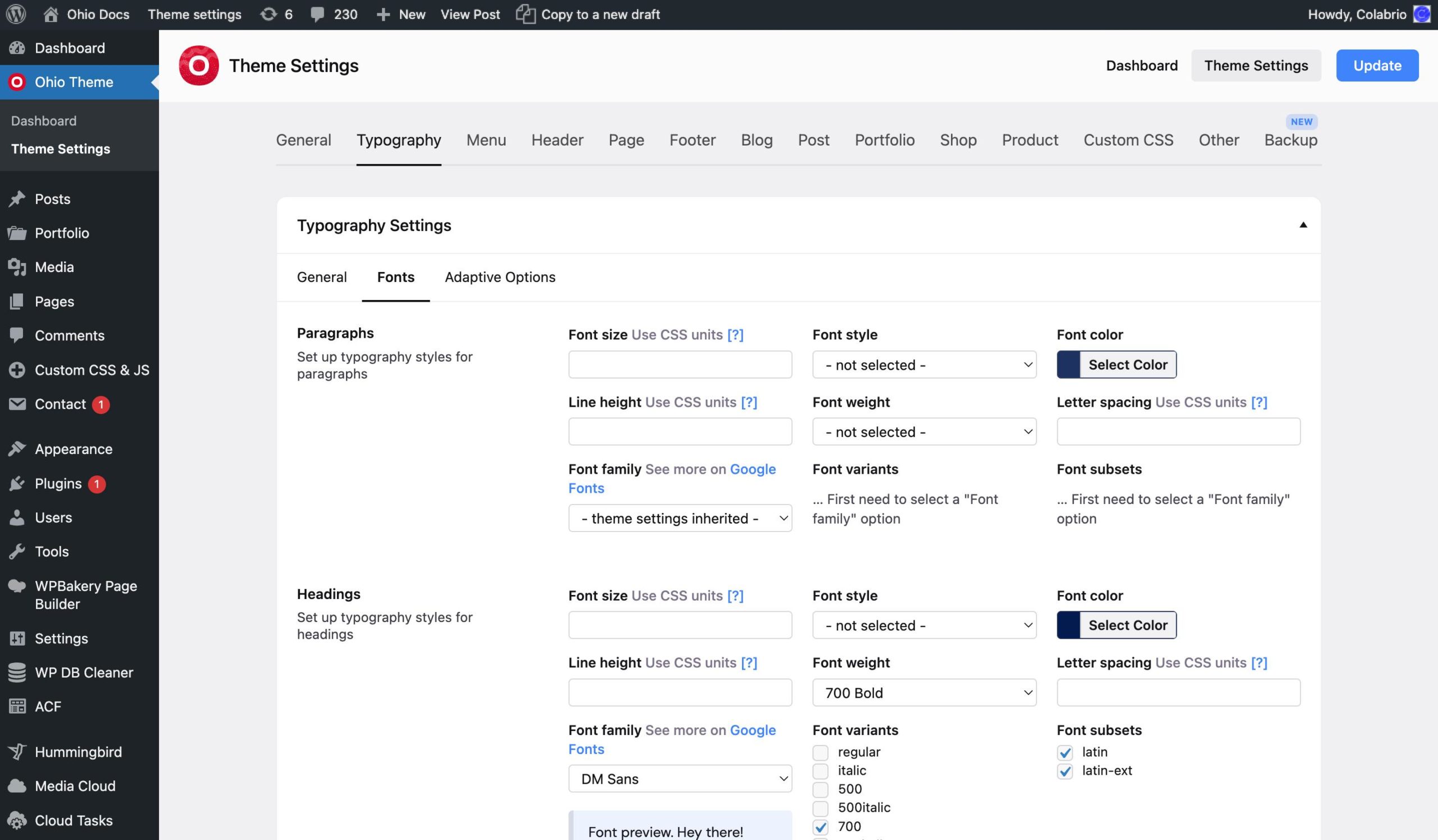
The Fonts tab allows you to choose the font family and set up typography-related properties such as font size, font style, font color, etc.
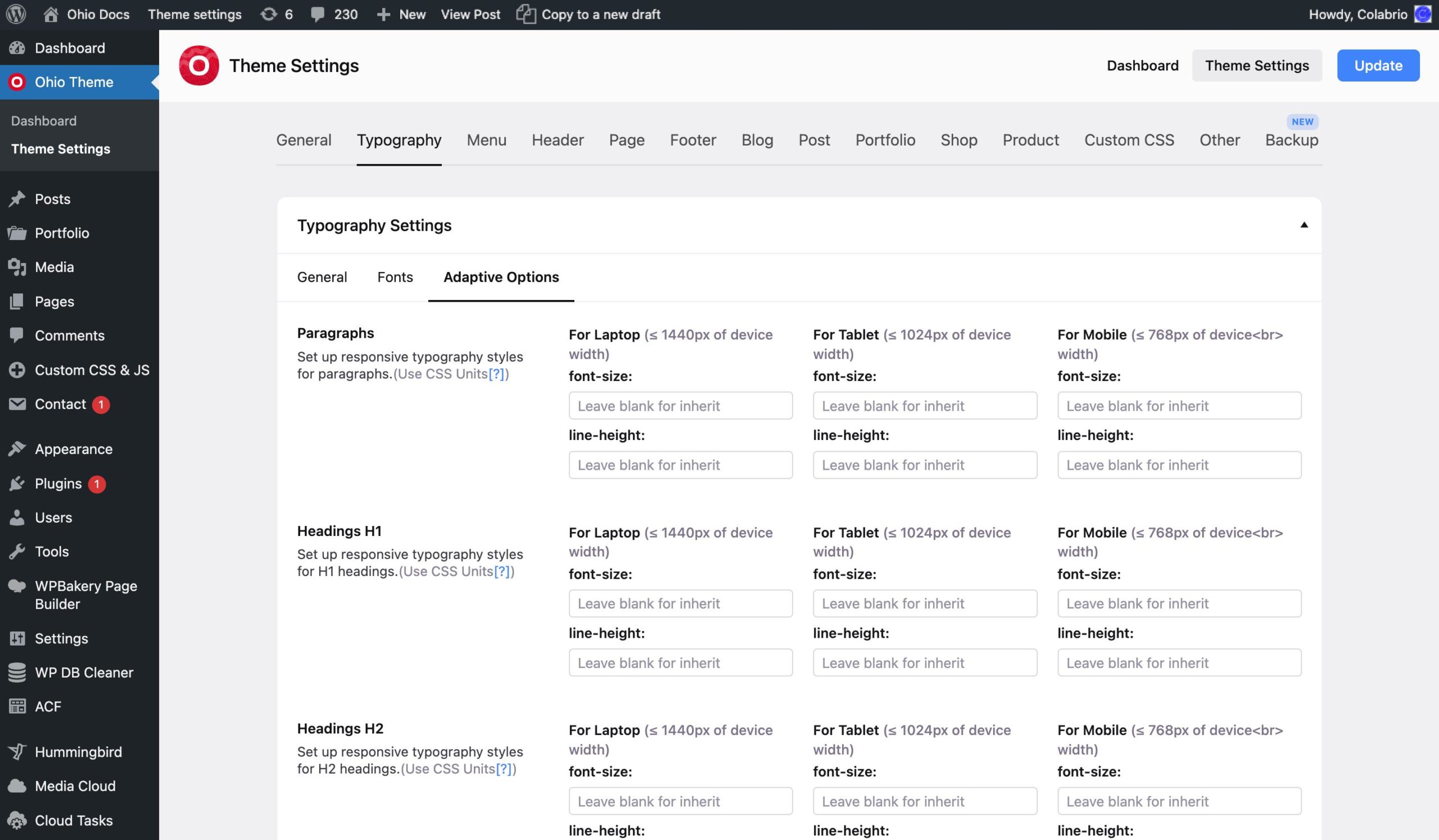
The Adaptive Options tab allows you to do the same as the Fonts tab but for mobile/tablet devices specifically as well.
This tab contains tabs such as General, Sticky Header, Subheader, and Other.
The General tab allows you to pick the style of your header by choosing one of the pictures that sort of gives you an idea of how this style looks. Also, it allows you to adjust some of the header values.
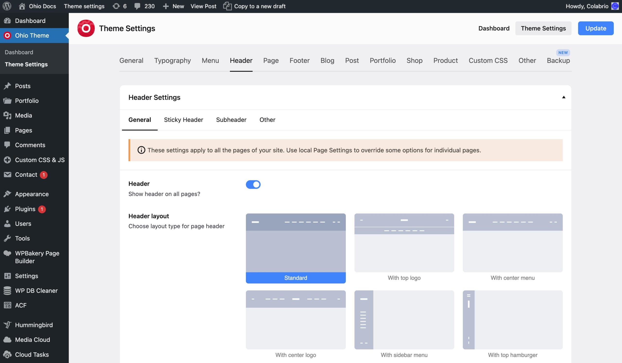
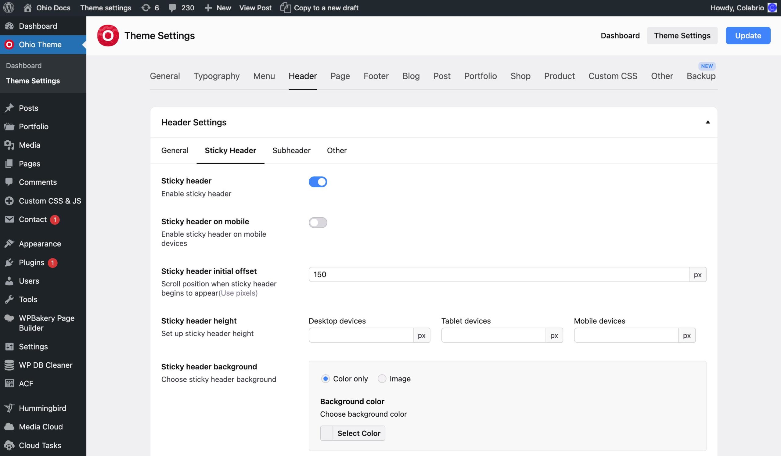
The Sticky Header tab allows you to do the same for the sticky header. The sticky header is the one that is displayed (if enabled) when the user has scrolled the page down past the first screen.
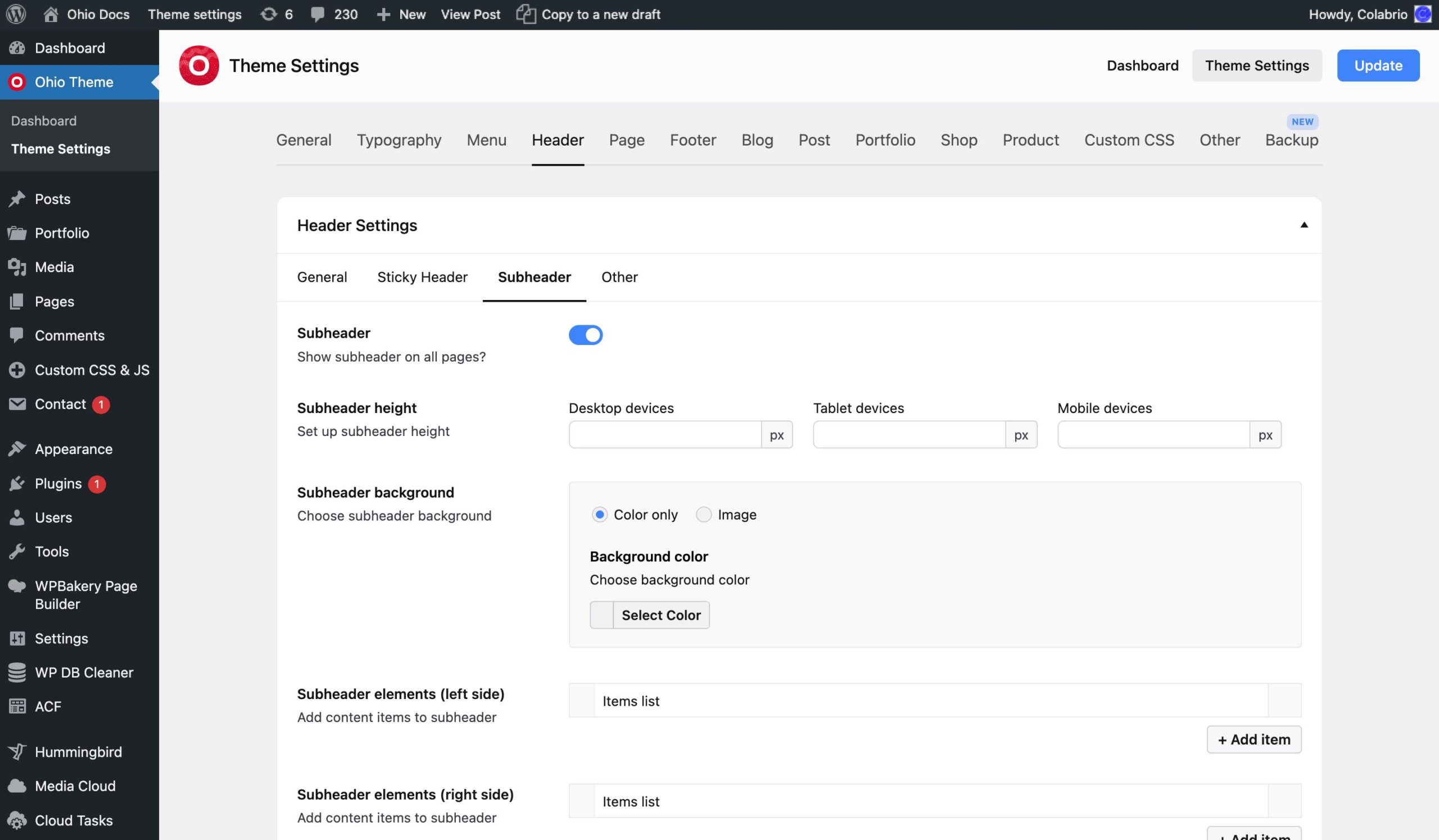
The Subheader tab allows you to set up the element before the header. Not all sites use and not all users need this element but it is a useful element at the top of your site that can contain your contact info, the site’s language, or a currency switcher. You can also set typography values for it.
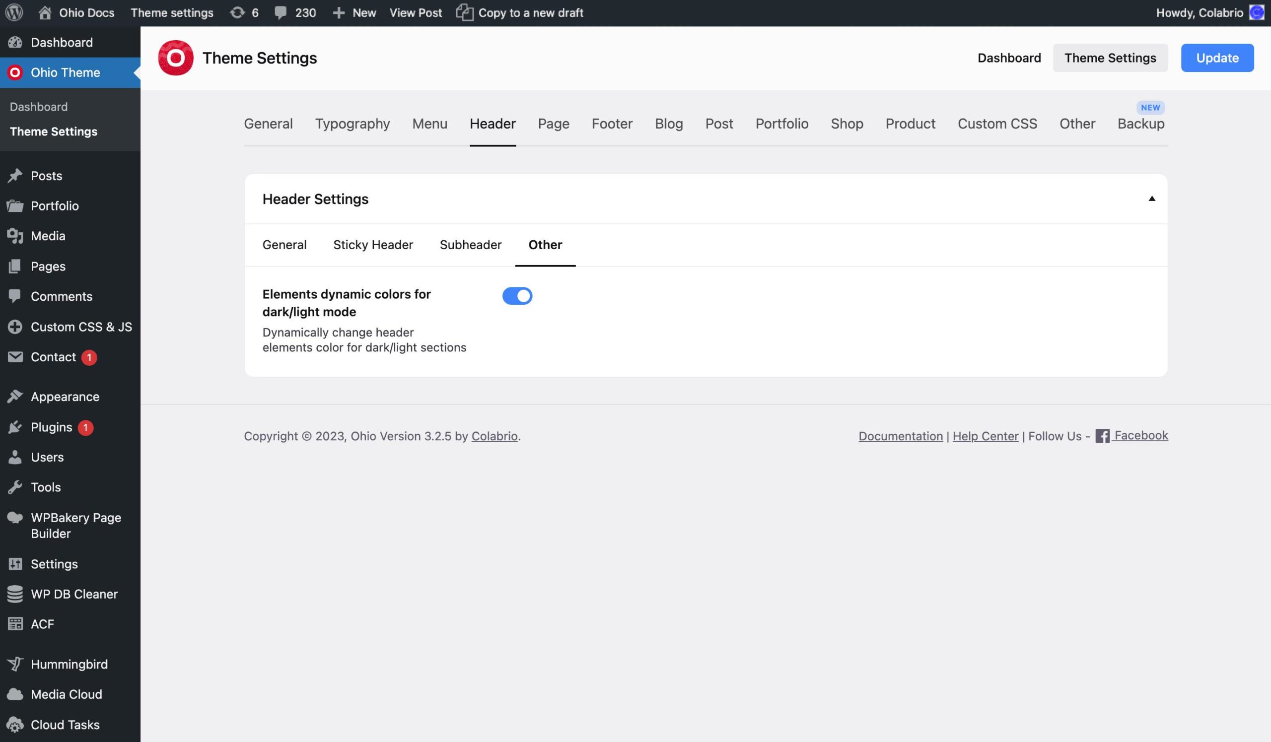
The Other tab contains an option to enable/disable the element’s dynamic colors for dark/light mode (helps to dynamically change the header’s elements color for dark/light sections).
This tab contains tabs such as General, Page Headline, Page Sidebar, Breadcrumbs, and Other.
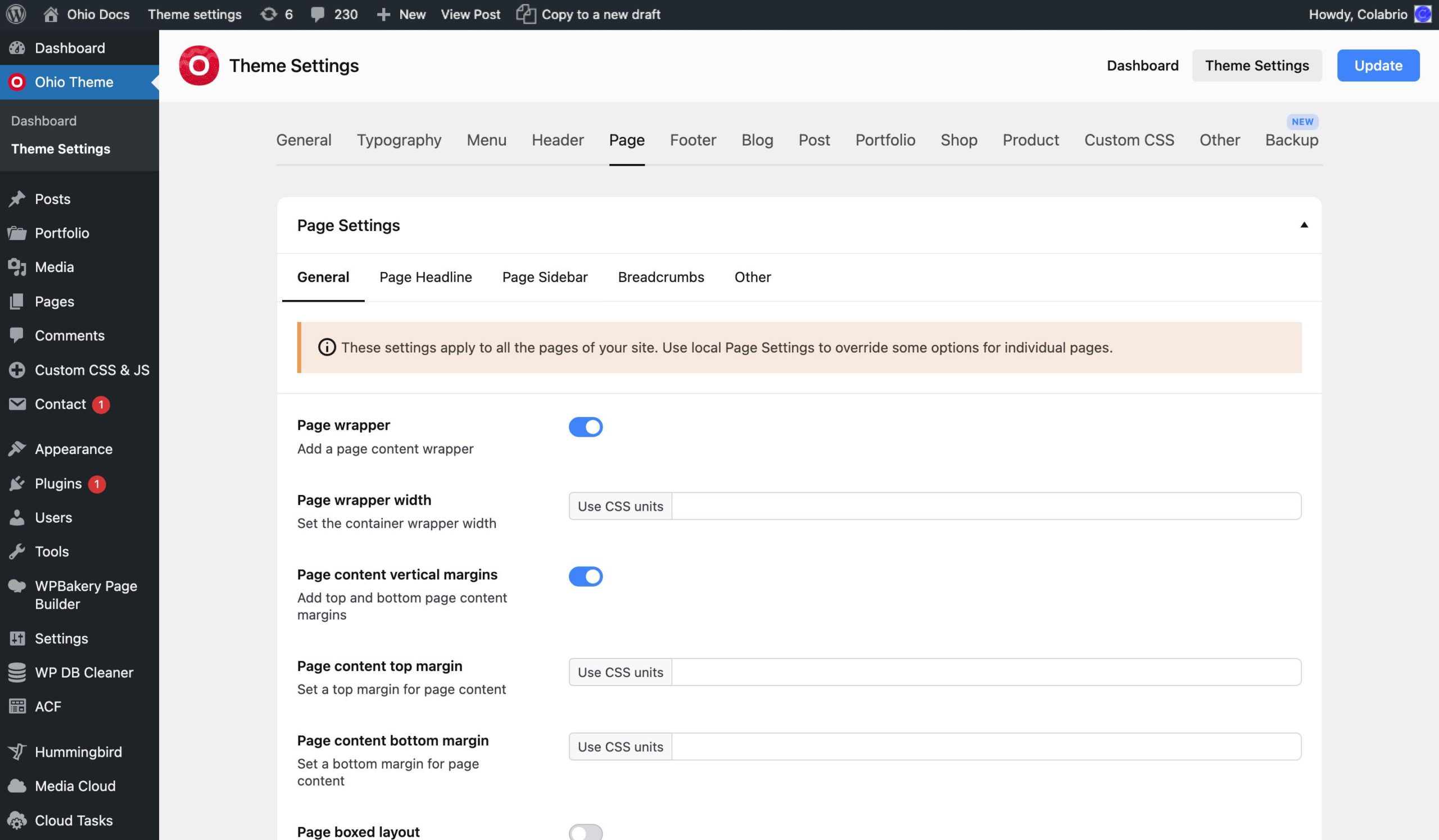
The General tab allows you to set the background of your site’s content area and add a wrapper (it makes the content more centered as it adds side paddings).
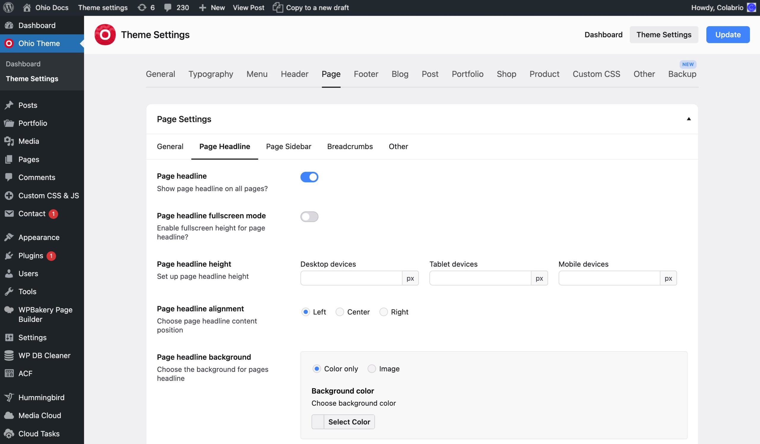
The Page Headline is what is displayed first in the content area of any default WordPress page. It contains the title of the page and can contain some additional meta details. Here you can set its background, typography, visibility, and some additional stylings.
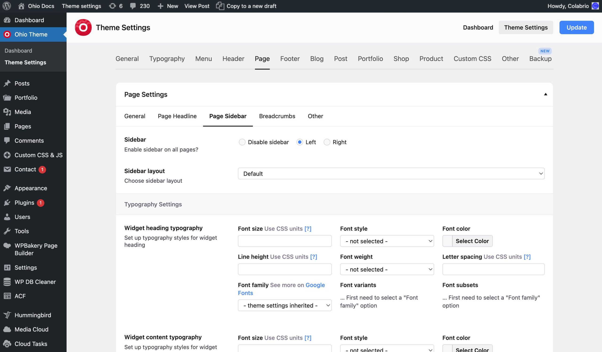
The Page Sidebar tab allows you to enable/disable the sidebar and set its typography values.
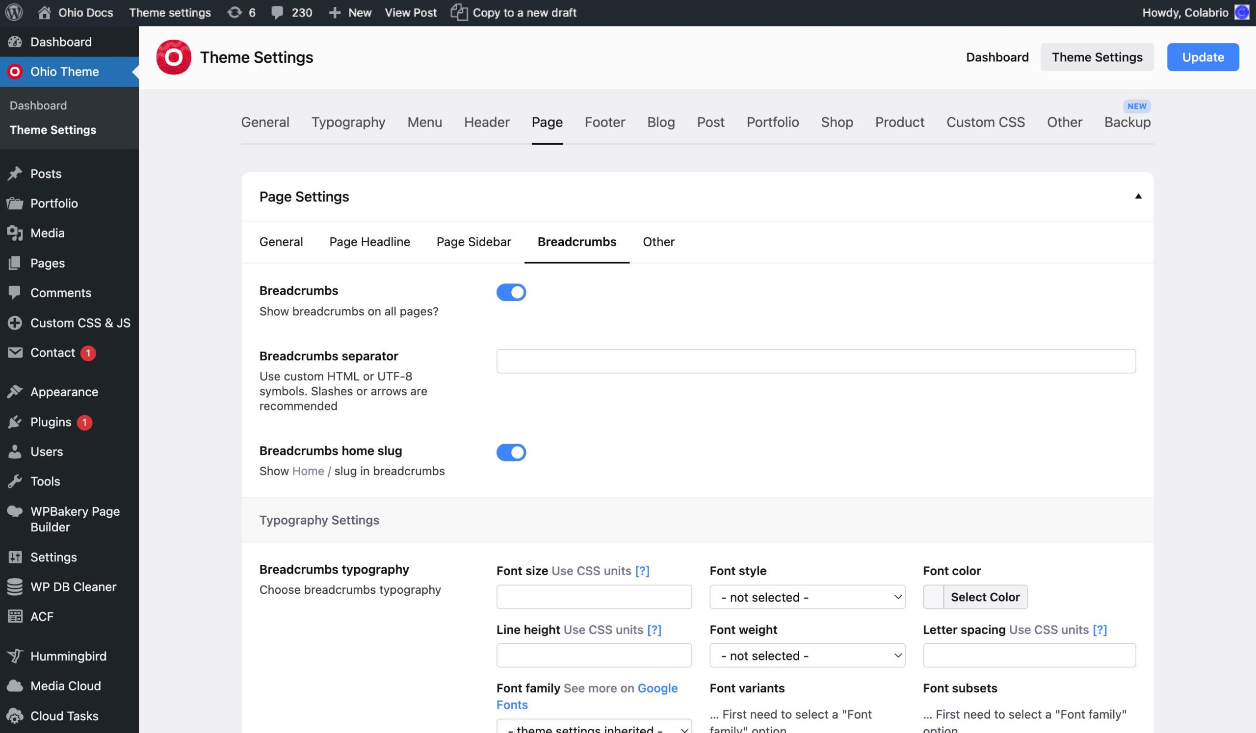
The Breadcrumbs are what is usually displayed at the top of the content showing you the hierarchy of pages that “contain” the current page (like Blog / Current Post). Here you can enable/disable breadcrumbs for your site and set some styling options.
The Other tab allows you to enable/disable scroll to top anchor link and adjust its styles.
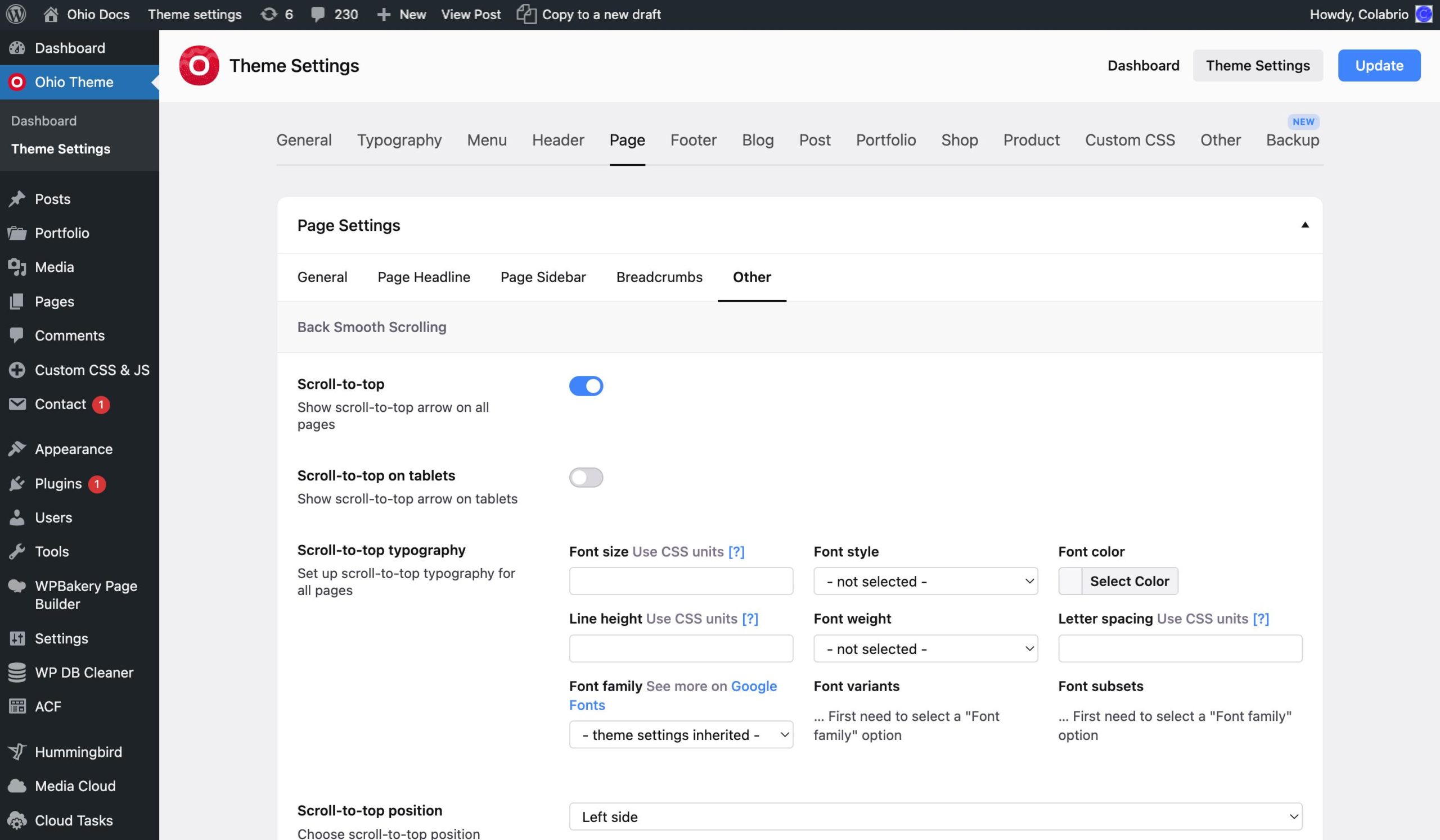
This tab contains tabs such as General, Cards, and Blog Page.
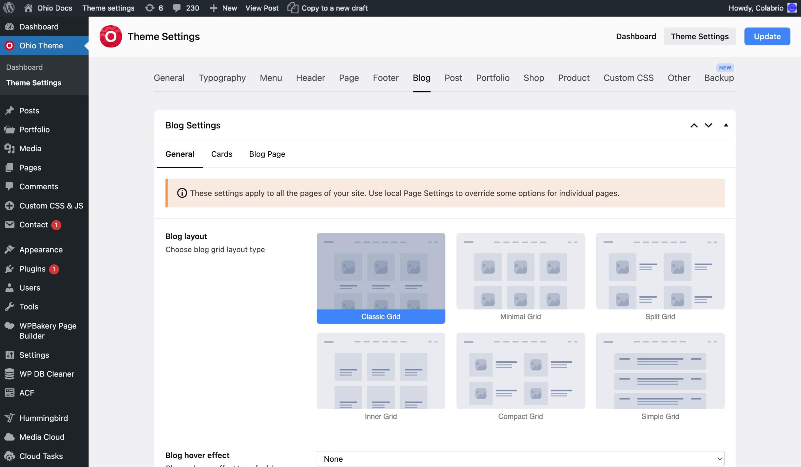
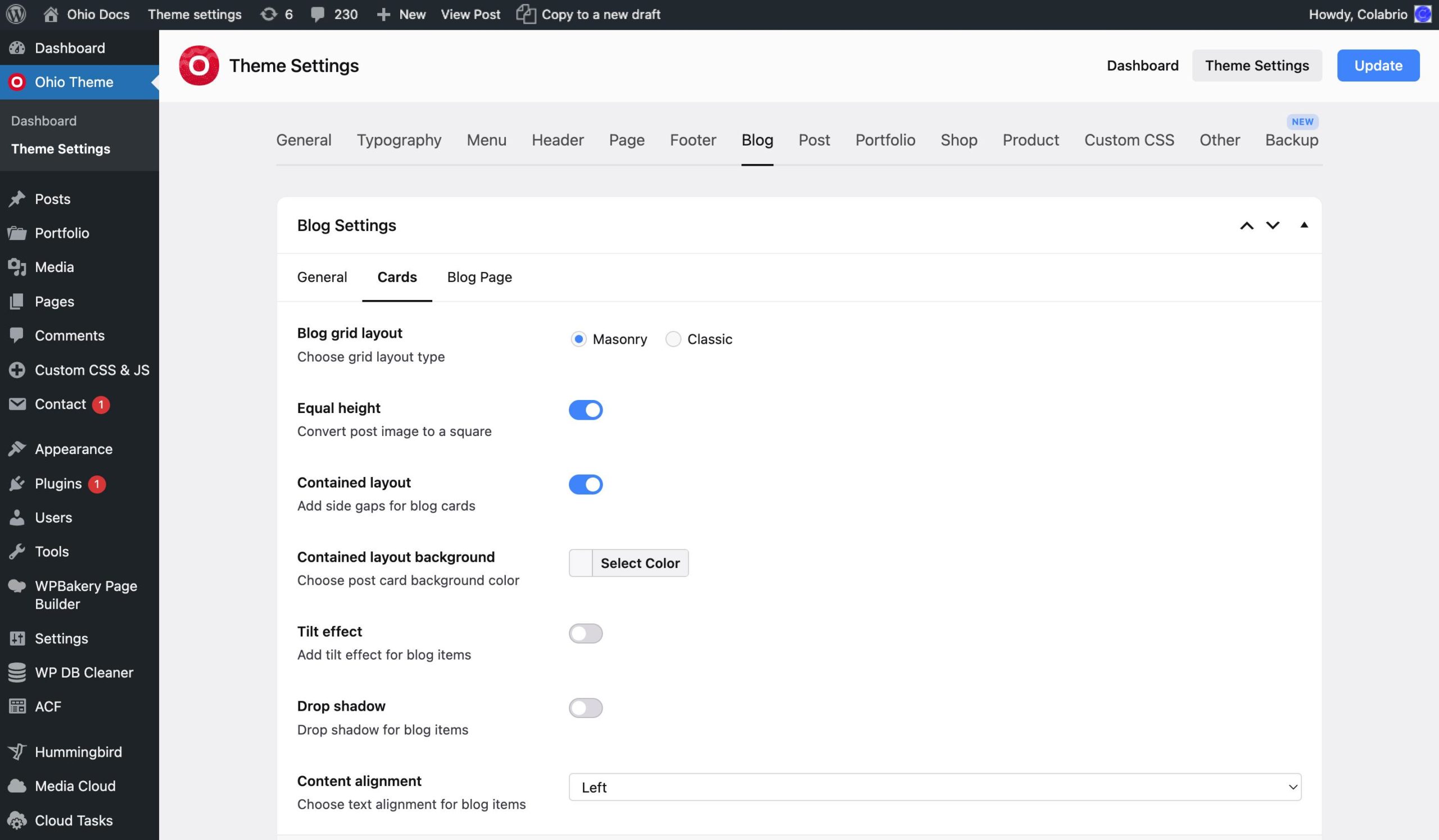
In the General and Cards tabs, you can set the style of your blog’s grid that contains your posts. Choose image size for blog items, hover effects, and set up typography.
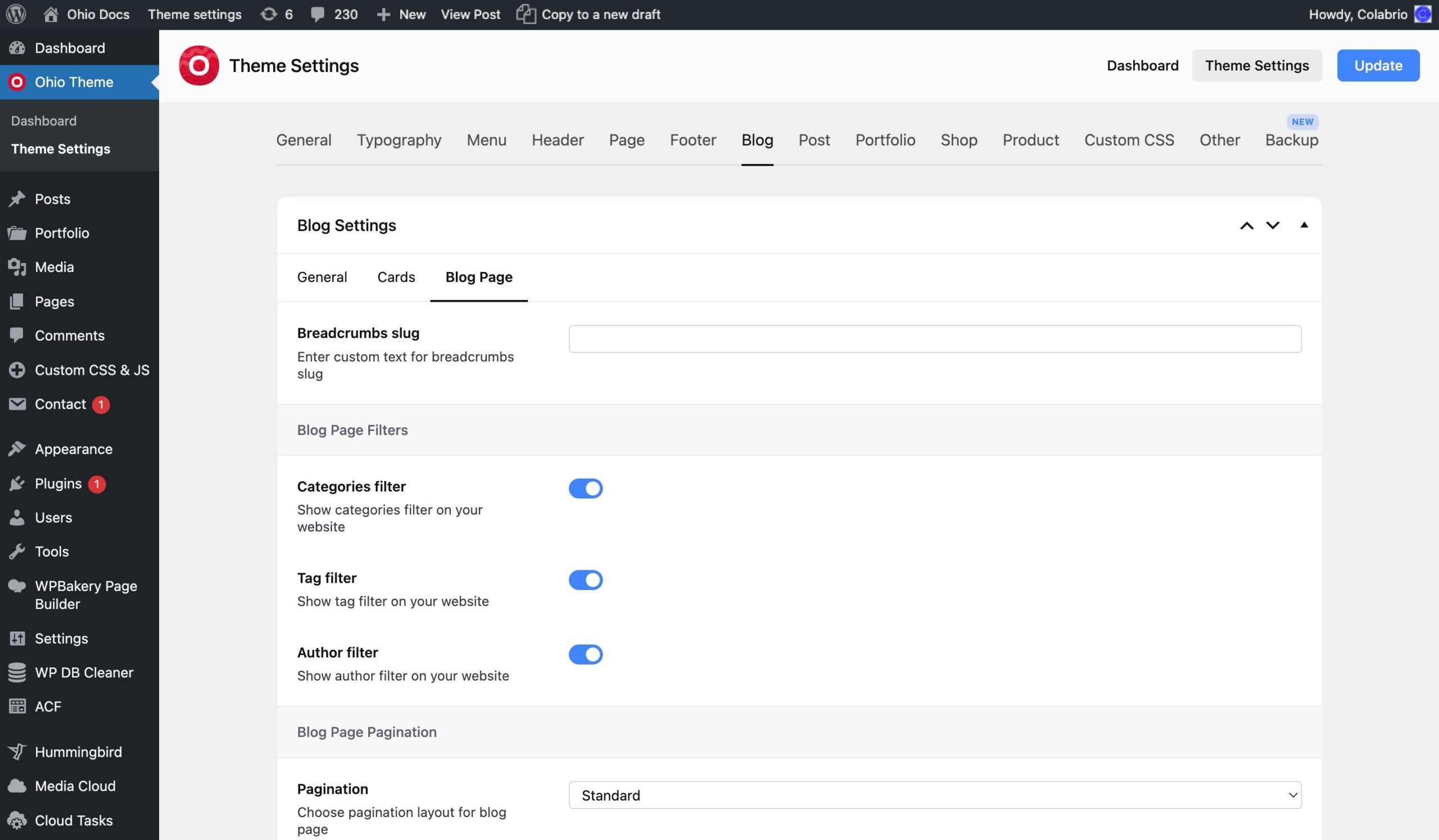
The Blog Page tab allows you to set up your blog’s pagination, breadcrumbs, custom content position, and display filters.
The Project custom post type is a thing that has been with us since the beginning and is available in all of our themes. Over time we’ve perfected it by listening to our users’ feedback and now it allows you to display your works in this beautiful format. This tab allows you to set up the styling of this type of post and the elements that display these posts.
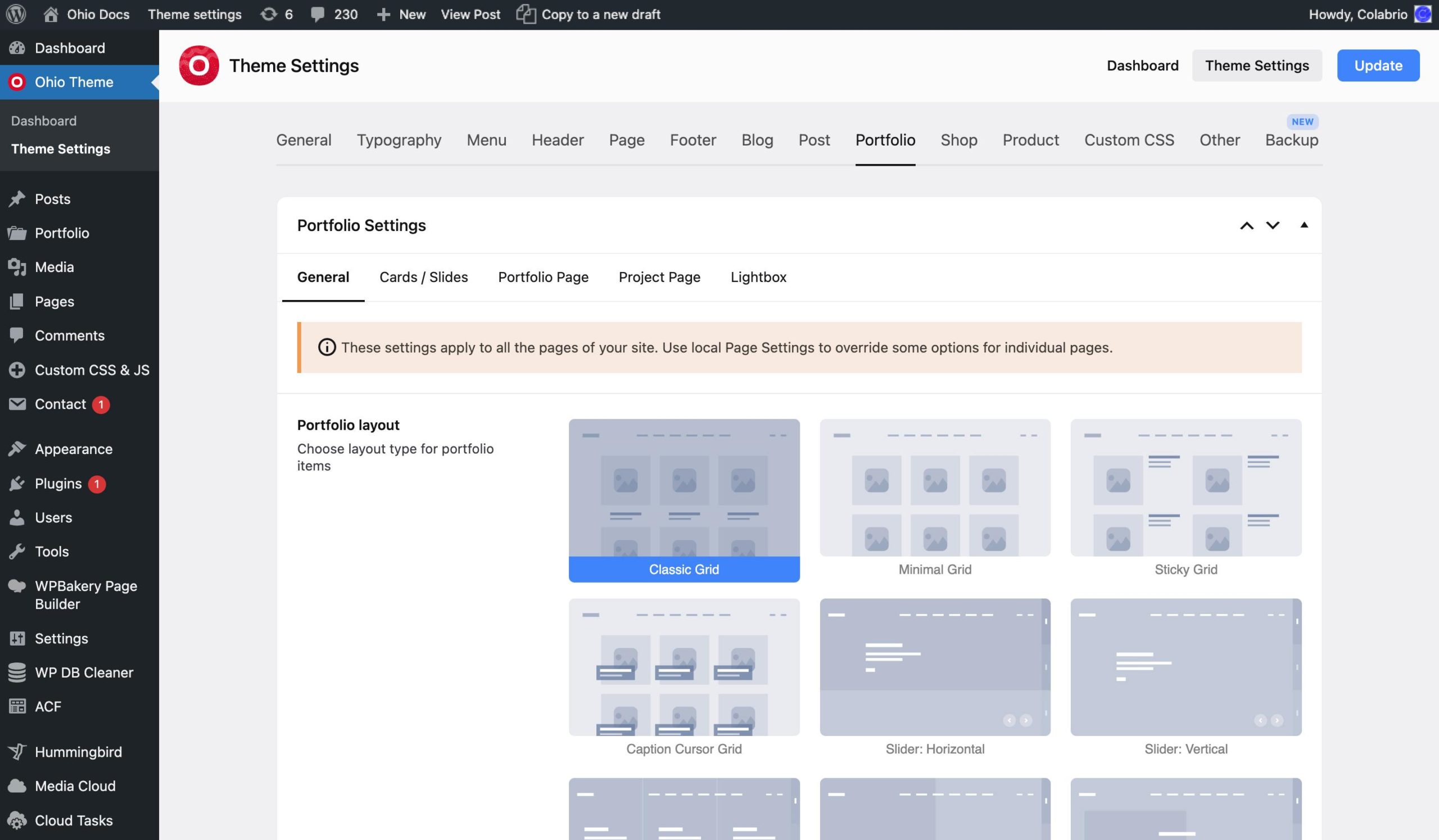
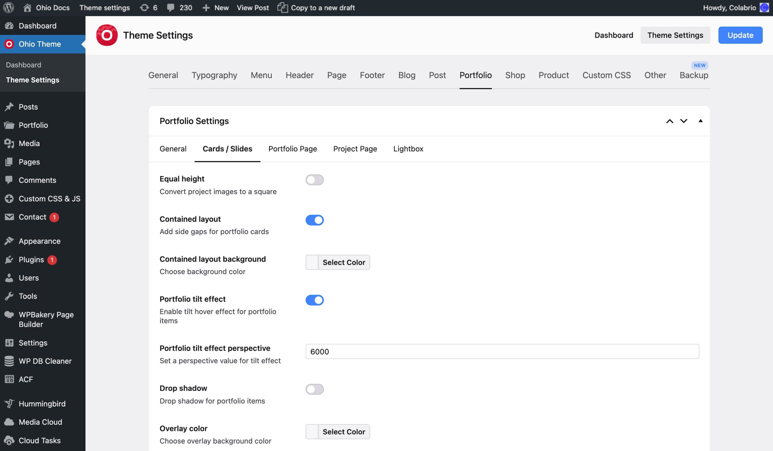
This tab contains the following tabs: General, Cards/Slides, Portfolio Page, Project Page, and Lightbox.
The General and Cards/Slides tabs allow you to set the style of the portfolio output and some styling options for those pages’ elements.
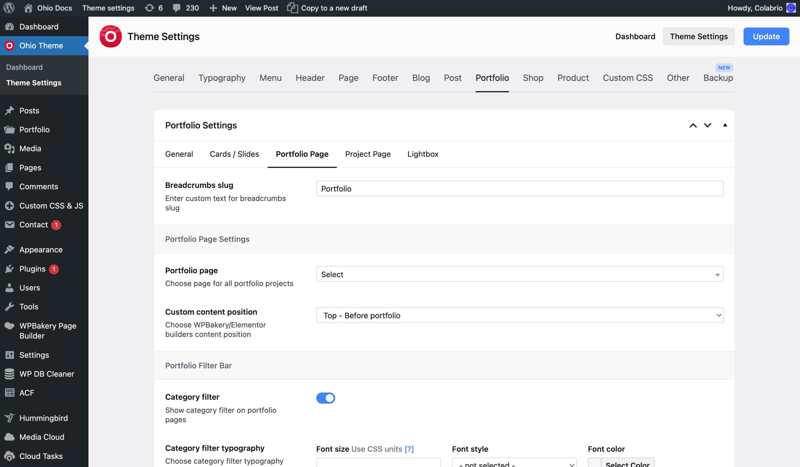
The Portfolio Page tab allows you to either use the options from the Page Settings or set custom values from the mentioned tab for portfolio pages individually. Also here you can set the main portfolio page using the “Portfolio page” option and your projects’ main breadcrumb will always lead to it.
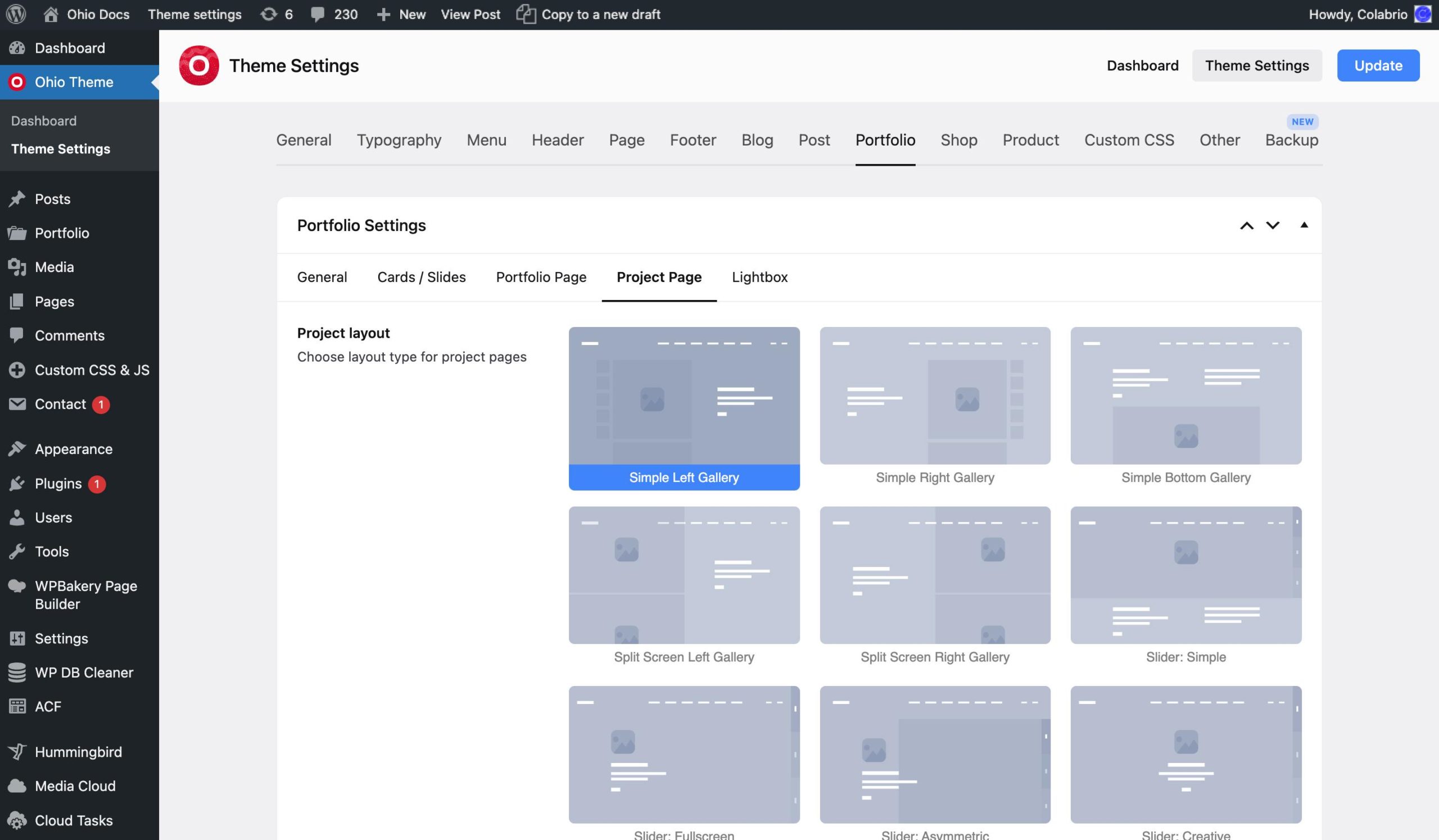
The Project Page tab allows you to set the layout of your single project pages and use some options from the Page Settings or set custom values from the mentioned tab for project pages individually.
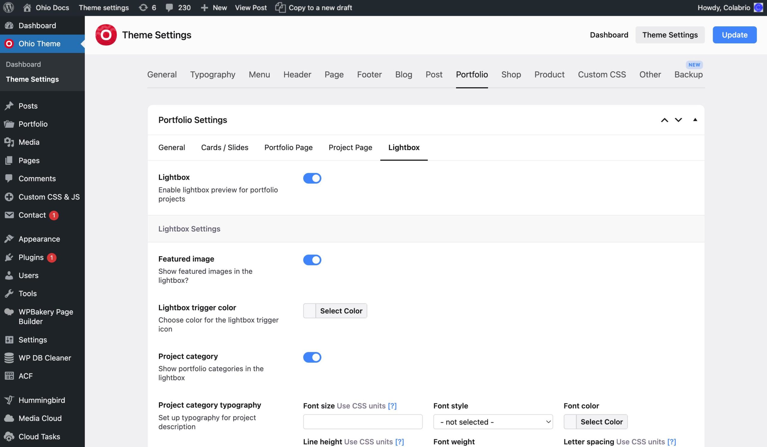
The Lightbox tab allows you to enable/disable project quick view and adjust its appearance;
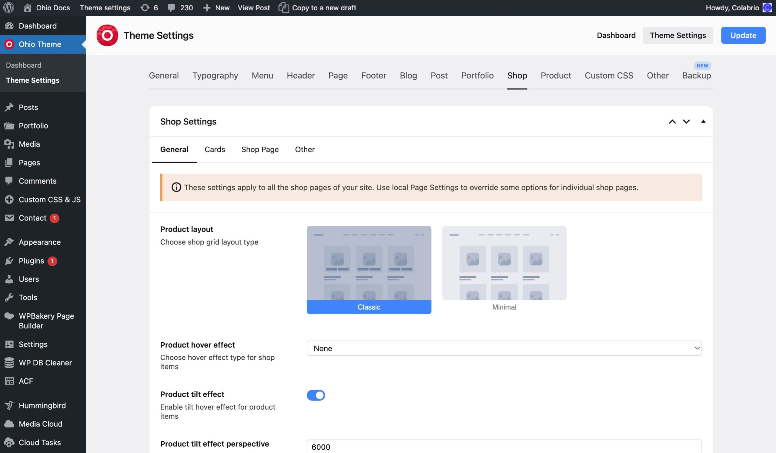
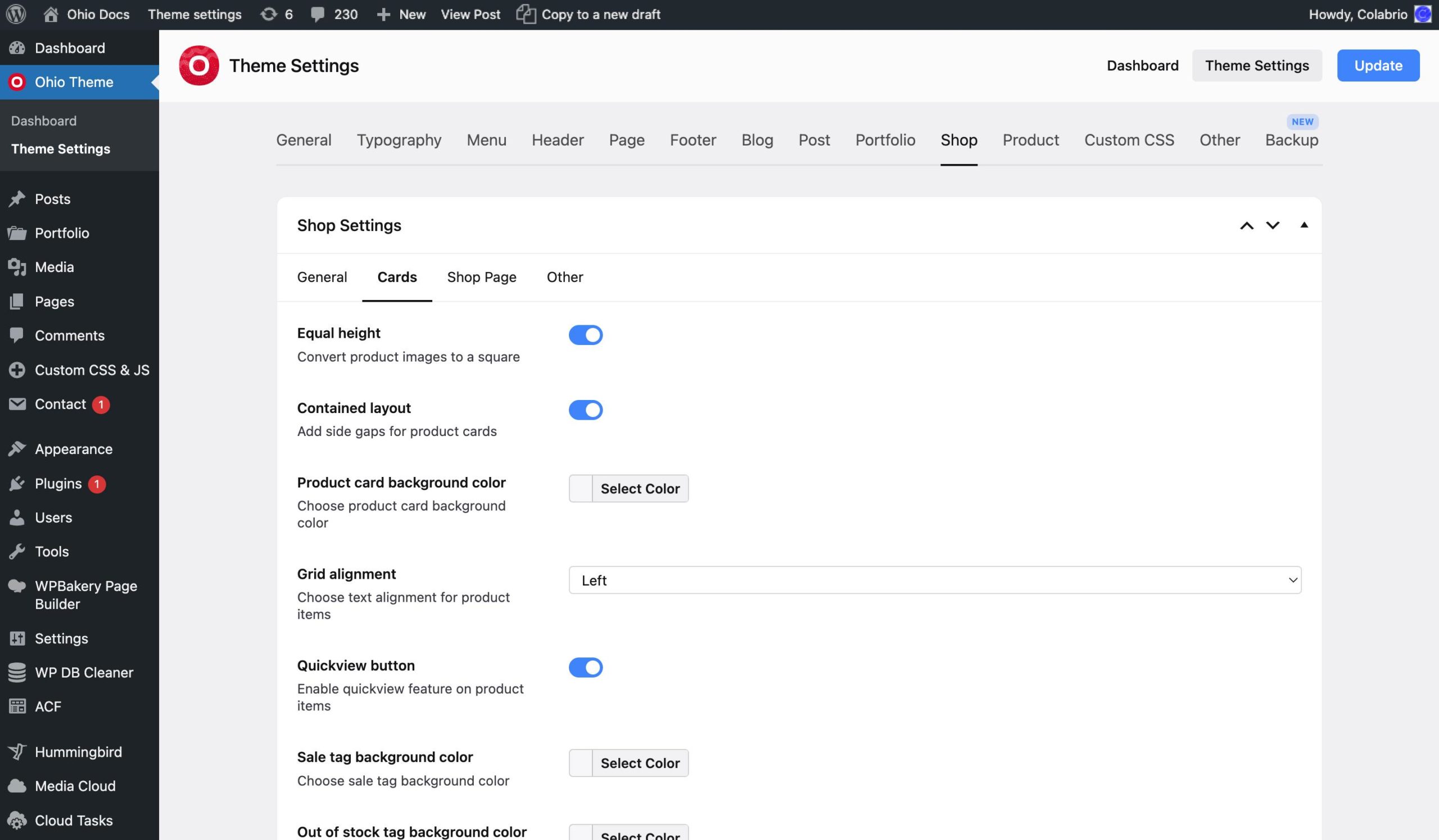
This tab contains tabs such as General, Cards, Shop Page, and Other.
The Genenar and Cards tabs allow you to set the style of pages that contain your products and these are very customizable. Each separate element of a shop page can have its own settings, be that the grid style, the hover effect, or the styling of cards in that grid.
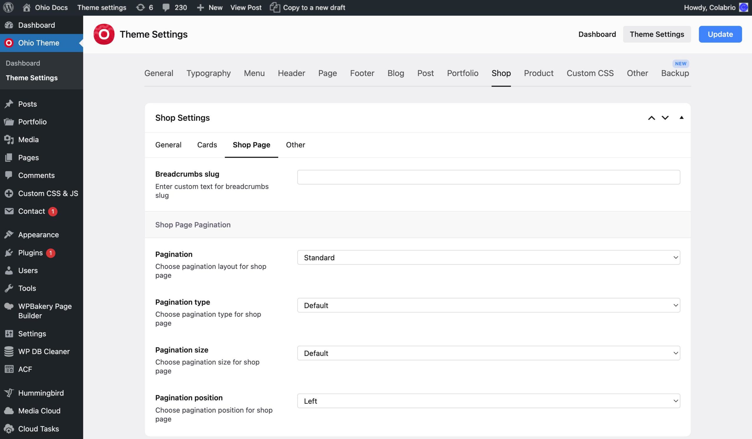
The Shop Page tab allows you to either use the options from the Page Settings or set custom values from the mentioned tab for shop pages individually.
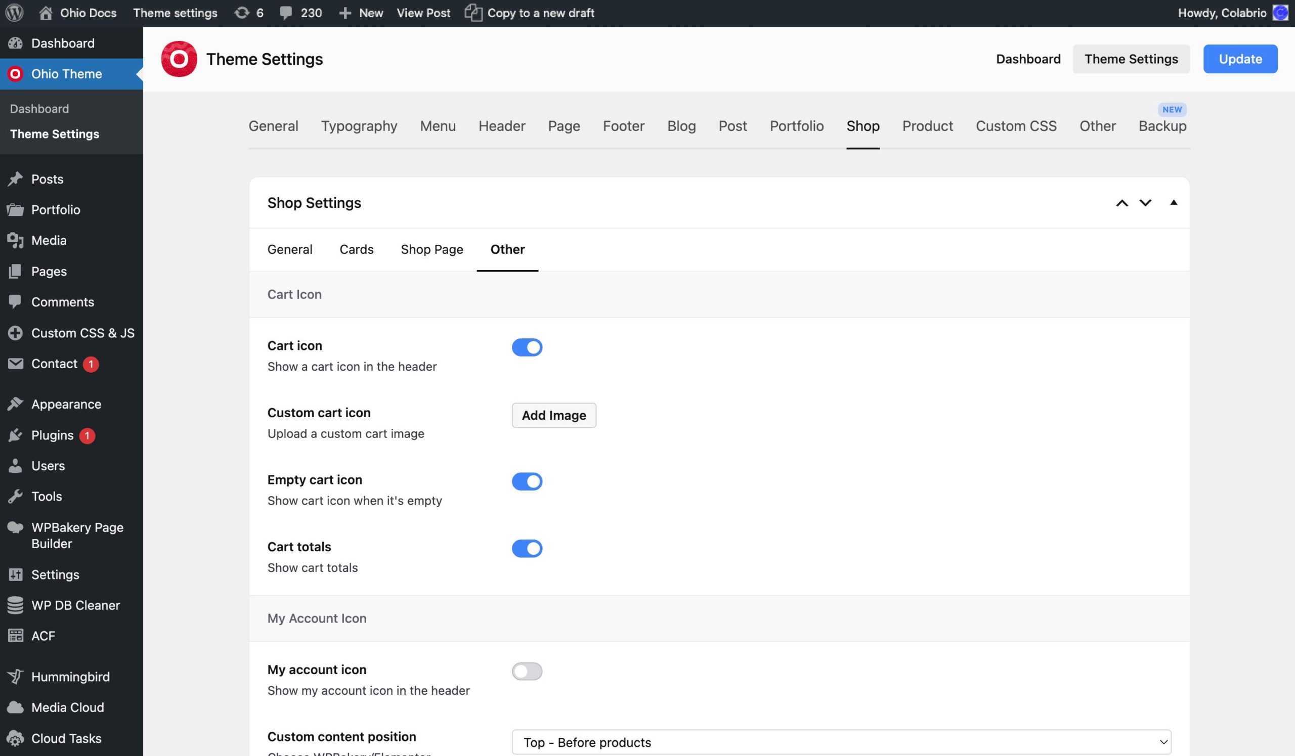
The Other tab allows you to enable/disable the cart icon on your website without disabling a WooCommerce functionality.
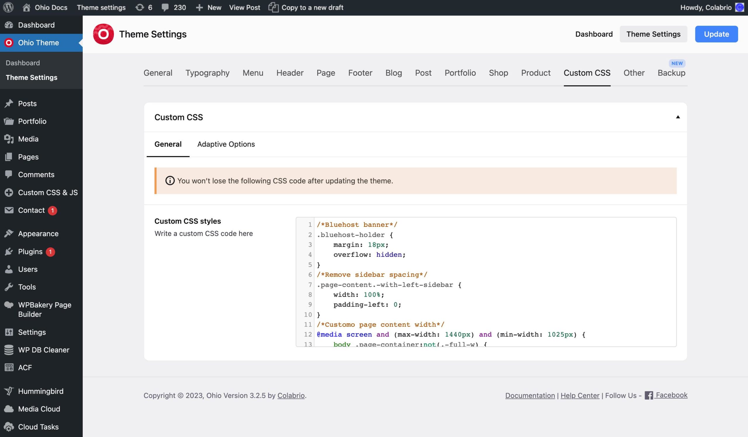
This tab contains the following tabs: General and Adaptive Options.
The General tab allows you to inject your custom CSS code into our theme. Any code you put in it will be displayed in the page’s source without any changes, the same way you wrote it.
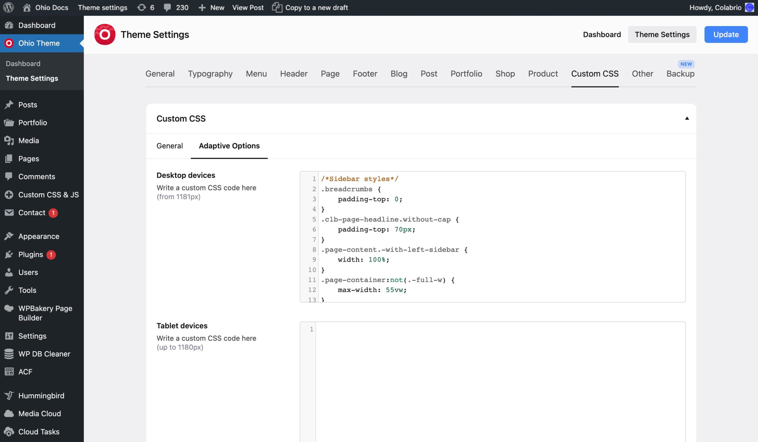
The Adaptive Options tab is a handy shortcut for multiple rules that you want to apply to a certain type of device only (mobile, tablet, desktop). Basically, it wraps any code put into it in a media query. For instance YOUR_CODE for mobile devices will end up looking like this:
@media screen and (max-width: 768px) {
    YOUR_CODE
}
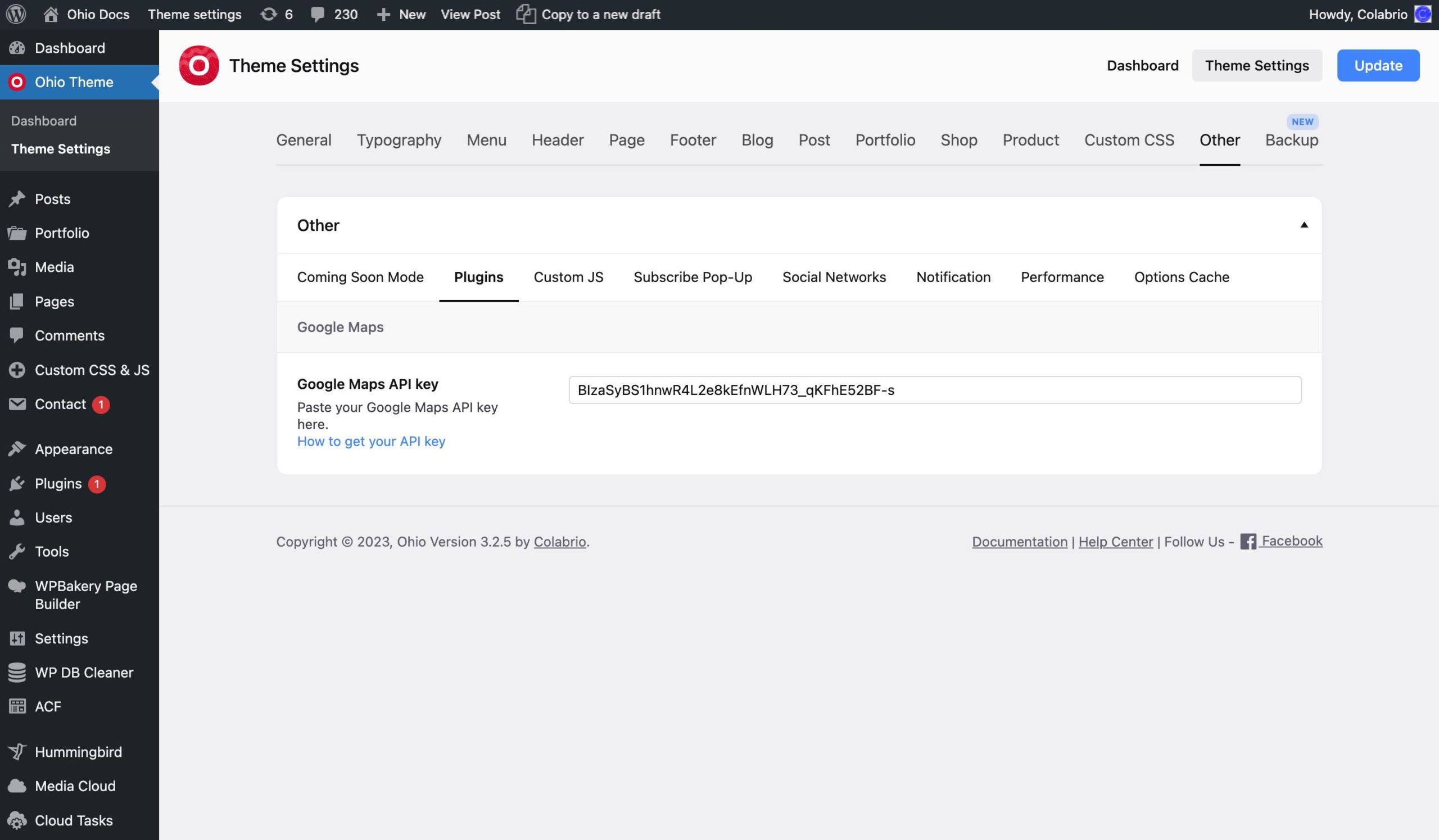
This tab contains the following five tabs: Coming Soon Mode, Plugins, Custom JS, Subscribe Pop-Up, Social Networks, Notification, Performance, and Options Cache.
In the Plugins tab, you must type in your Google Maps API key to be able to use Google Maps. Without it the Google Maps element will not work, you will see only a grey square on the front end and get an error in your console.
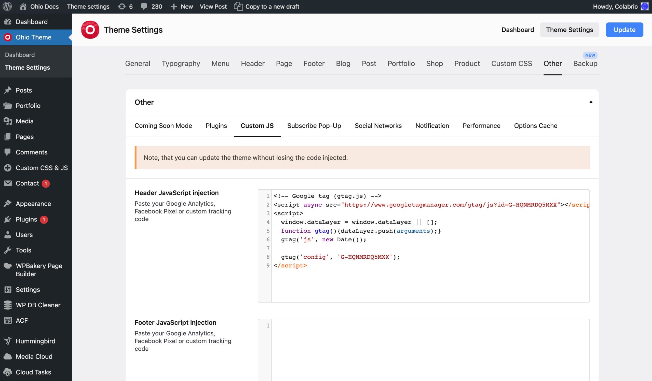
In the Custom JS tab, you can inject JS into your site. For instance, you can put your Google Analytics code there.
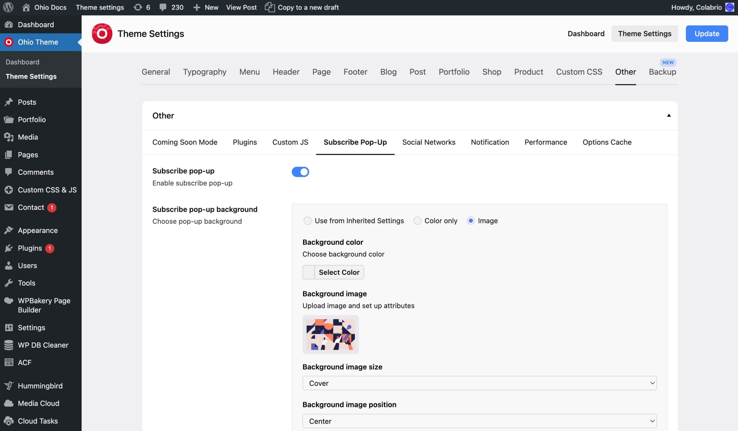
What is a modern WordPress theme without a built-in site-wide subscription pop-up option?
The Subscribe Pop-Up tab allows you to enable/disable the pop-up, set its typography and appearance, content, and choose the subscribe form (previously created with ContactForm7 plugin) that will be used in it.
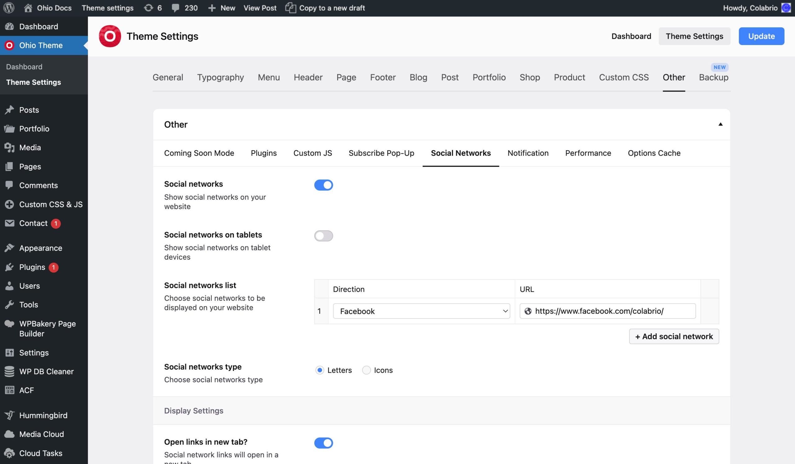
The Social Networks tab allows you to create a list of your sharing links and adjust their typography.
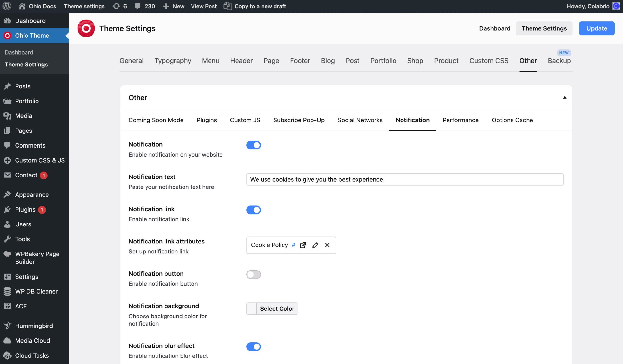
In the Notification tab you can set up a small button/notification that will be fixed on your site’s pages and will be displayed once in a period you set.
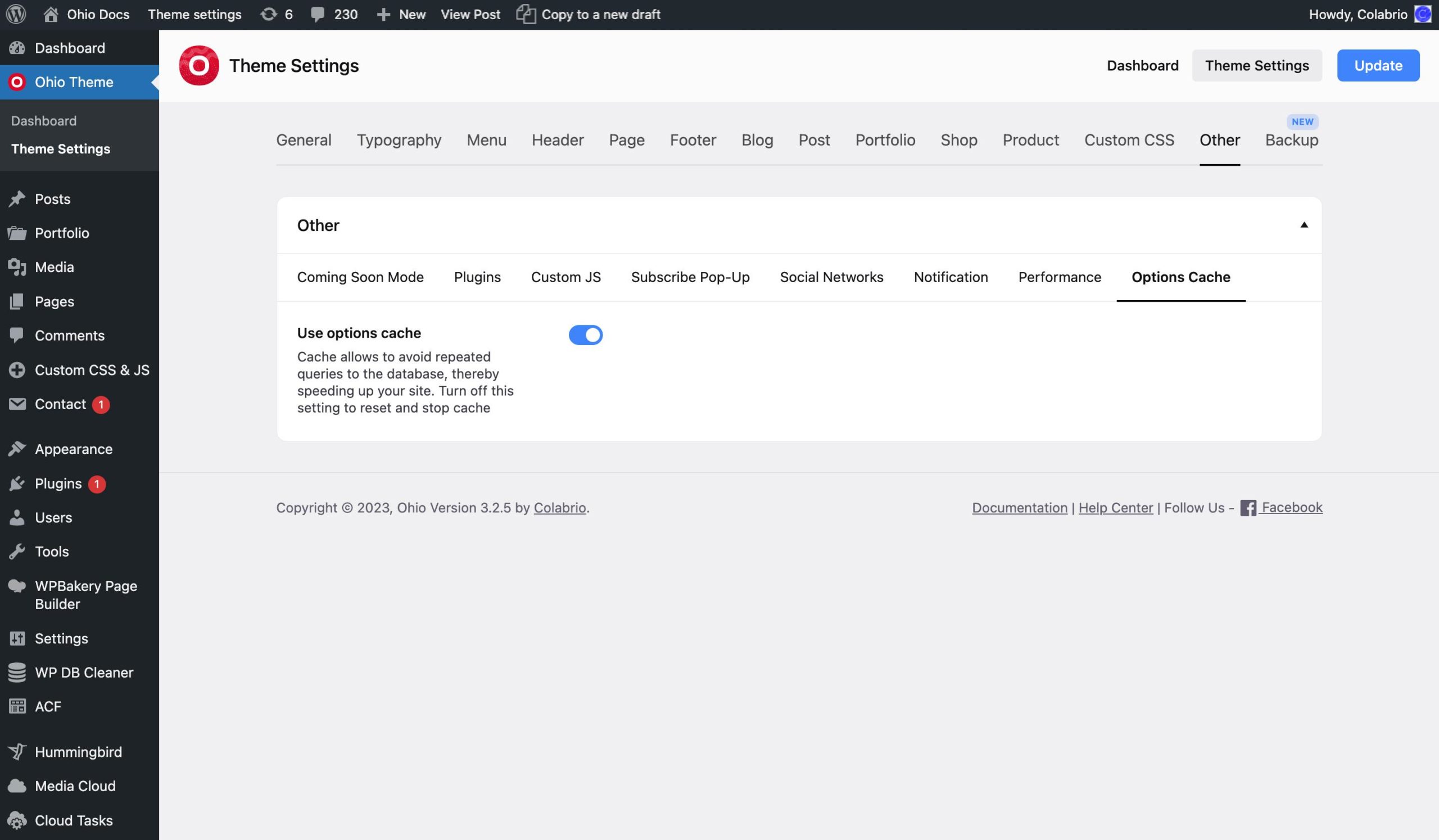
In the Options Cache tab, you can enable/disable using Theme Settings options cache for better performance.
There’re options to export/import and reset Theme Settings in the Backup section. That will allow you to restore previously exported options.
