5. Theme Settings #
Brief overview #
The Theme Settings dashboard category contains 14 tabs.
In almost each of these (except for the “Get Help” tab) you can customize a certain part of your website.

In this article we’ll briefly explain what you can do in each of these tabs.
5.1 Branding #
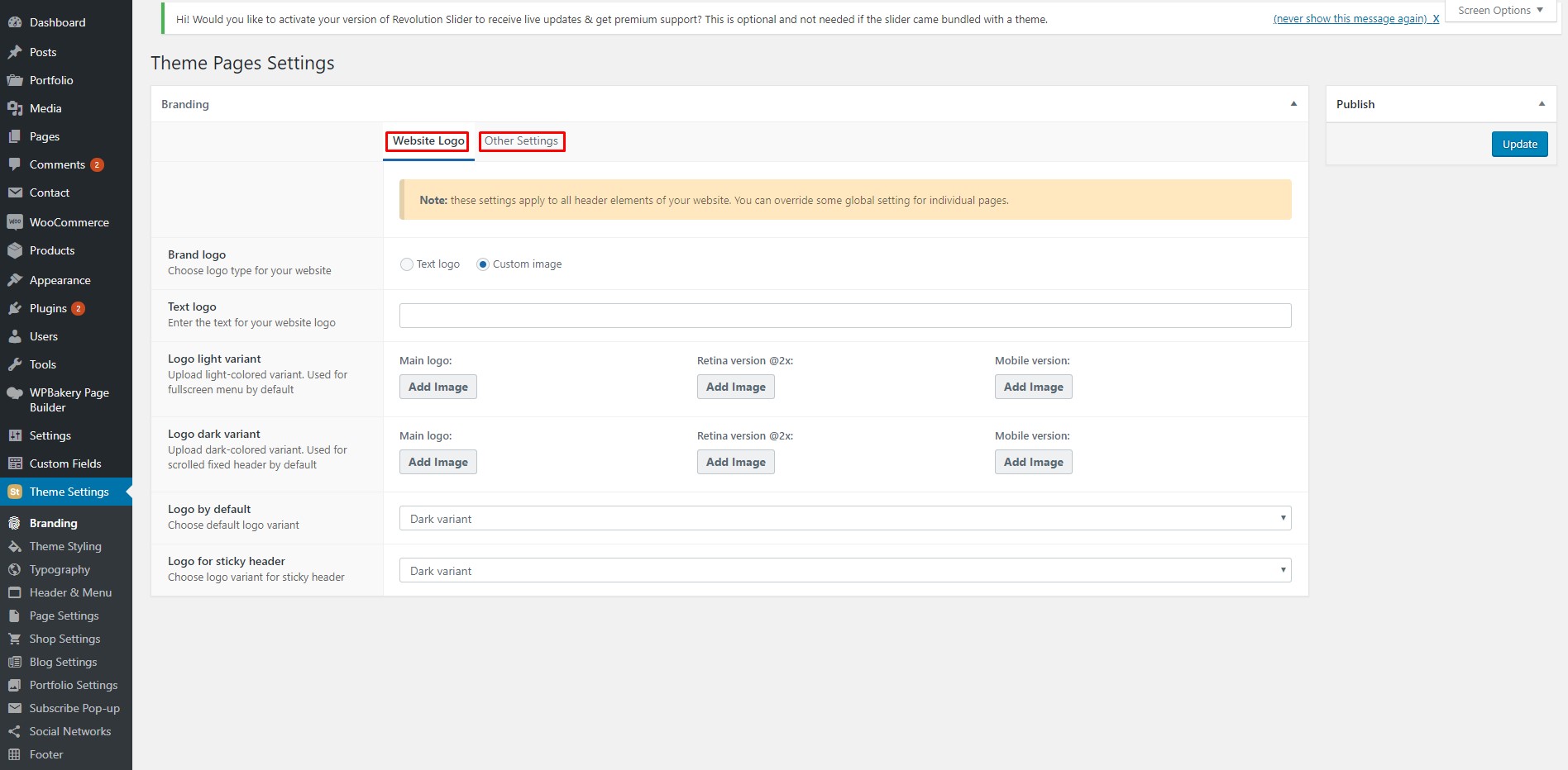
This tab contains such tabs as Website Logo and Other Settings.
The Website Logo tab allows you to upload a logo image that will be used site-wide or use a text logo.
The logo can be uploaded in two variants and you can choose the default one. This is very helpful in case you have pages with different backgrounds and are using a transparent header. It makes you available to choose the logo which looks the best for each of your pages individually.
The Other Settings tab contains a link to where you can set a favicon for your site.
5.2 Theme Styling #
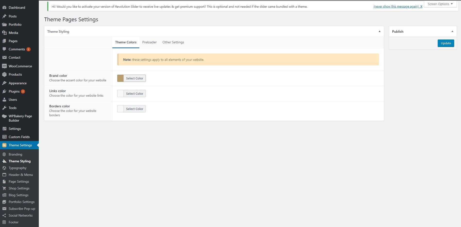
This tab contains tabs such as Theme Colors, Preloader and Other Settings.
The Theme Colors tab allows you to set the default colors for links, borders and the brand color.
These are basically handy shortcuts for all of your site’s elements that will set the color you choose here unless you set the color explicitly when editing your page/element.
The Preloader tab allows you to disable/enable and set the style of your preloader (the animation you see when visiting a site using Stockie when it has not been loaded yet) including the color and type.
The Other Settings tab allows you to enable/disable and set the color for the “Back to top” button that appears when the visitor has scrolled past a certain height value.
5.3 Typography #
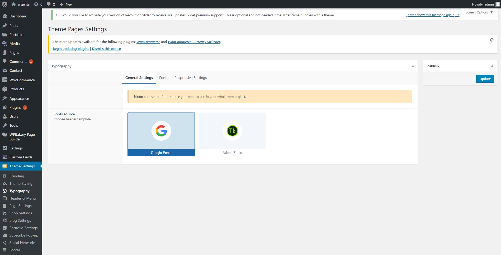
This tab contains tabs such as General Settings, Fonts and Responsive Settings.
The General Settings allow you to choose between Google Fonts (default) and TypeKit fonts. We added this option as we were requested for TypeKit support many times with our previous themes.
The Fonts tab allows you to set the font and most of typography-related values for your site.
The Responsive Settings tab allows you to do the same as the Fonts tab but for mobile/tablet devices specifically as well.
5.4 Header & Menu #
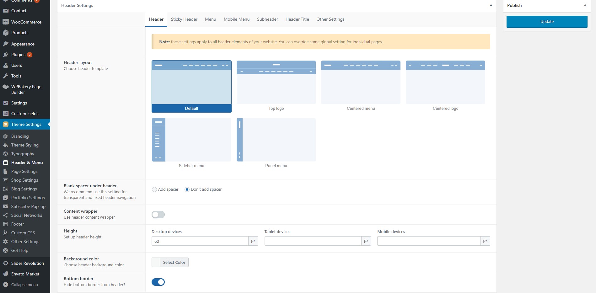
This tab contains tabs such as Header, Sticky Header, Menu, Mobile Menu, Subheader, Header Title, Other Settings.
The Header tab allows you to pick the style of your header by choosing one of the pictures that sort of give you the idea of how this style looks. Also it allows you to adjust some of the header values.
The Sticky Header tab allows you to to do the same for the sticky header. The sticky header is the one that is displayed (if enabled) when the user has scrolled the page down past the first screen.
The Menu tab allows you to choose the style of your menu (hamburger or extended), adjust its typography and change some other styling values.
The Mobile Menu tab allows you to do the same for the mobile menu which can have its own settings.
The Subheader tab allows you to set up the element before the header. Not all sites use and not all users need this element but it is a useful element at the top of your site that can contain your contact info, the site’s language or currency switcher. You can also set typography values for it.
The Header Title is what displayed first in the content area of any default WordPress page. It contains the title of the page and can contain some additional information. Here you can set its background, typography, visibility and some additional stylings.
The Other Settings tab contains switchers that enable/disable the language switchers that allow the user to choose the language of the site when the site is translated with WPML, an option to hide the ‘Search’ icon in the header and enable the one-page scroll menu.
5.5 Page Settings #
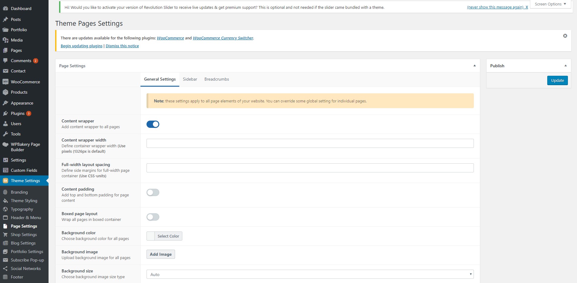
This tab contains tabs such as General Settings, Sidebar, Breadcrumbs.
The General Settings tab allows you to set the background of your site’s content area and add a wrapper (it makes the content more centered as it adds side paddings).
The Sidebar tab allows you to enable/disable the sidebar and set its typography values.
The Breadcrumbs are what is usually displayed at the top of the content showing you the hierarchy of pages that “contain” the current page (like Blog / Current Post). Here you can enable/disable breadcrumbs for your site and set some styling options.
5.6 Shop Settings #
Stockie was initially designed as a eCommerce theme so it has plenty of settings for your shop pages.
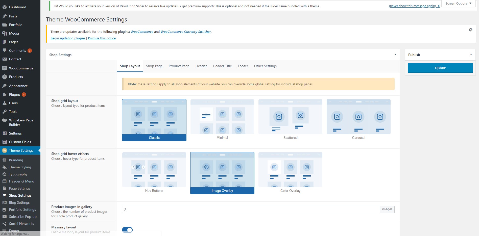
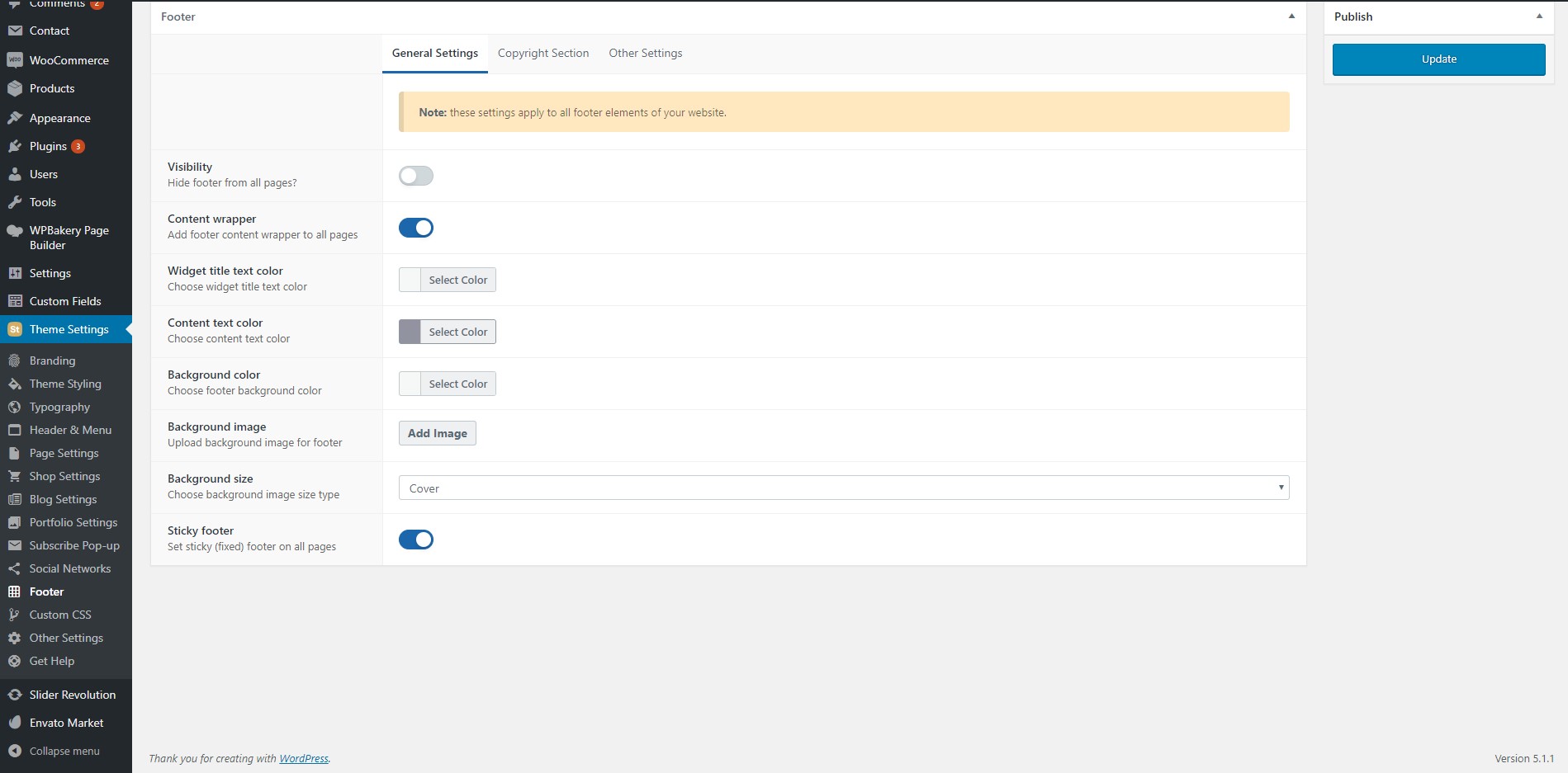
This tab contains tabs such as Shop Layout, Shop Page, Product Page, Header, Header Title, Footer, Other Settings.
The Shop Layout page allows you to set the style of pages that contain your products and these are very customizable. Each separate element of a shop page can have its own settings, be that the grid style, the hover effect or the styling of cards in that grid.
The Shop Page tab allows you to either use the options from the Page Settings or set custom values from the mentioned tab for shop pages individually.
The Product Page tab allows you to set the layout and typography of your product pages, enable/disable multiple features such as tags, categories, lightbox preview, etc.
The Header, Header Title and Footer tabs allow you to either use the options from the Header & Menu, Footer tabs or set custom values from the mentioned tab for shop pages individually.
The Other Settings tab allows you to enable/disable the cart and sharing icons.
5.7 Blog Settings #
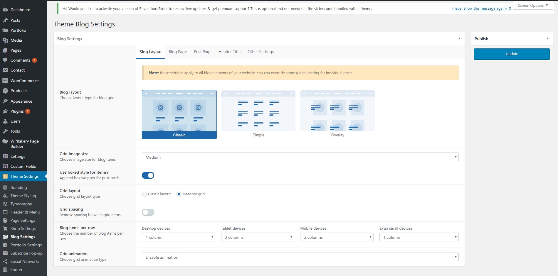
This tab contains tabs such as Blog Layout, Blog Page, Post Page, Header Title, Other Settings.
In the Blog Layout tab you can set the style of your blog’s grid that contains your posts.
The Blog Page tab allows you to set up your blog’s pagination, breadcrumbs, custom content position and display filters.
The Post Page tab allows you to either use the options from the Page Settings or set custom values from the mentioned tab for post pages individually.
The Header Title tab allows you to either use the options from the Header & Menu tab or set custom values from the mentioned tab for post pages individually.
In the Other Settings tab you can add social network icons to make your users able to share your posts, hide the author’s nickname from blog posts and add the author’s social network links.
5.8 Portfolio Settings #
The Project custom post type is a thing that has been with us since the beginning and is available in all of our themes. Over time we’ve perfected it listening to our users’ feedback and now it allows you to display your works in this beautiful format. This tab allows you to set up the styling of this type of posts and elements that display these posts.
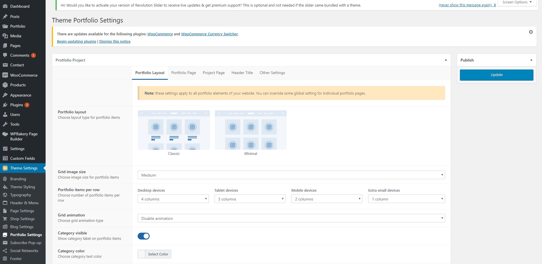
This tab contains the following tabs: Portfolio Layout, Portfolio Page, Project Page, Header Title, Other Settings.
The Portfolio Layout page allows you to set the style of pages that contain your projects and some styling options for those pages’ elements.
The Portfolio Page tab allows you to either use the options from the Page Settings or set custom values from the mentioned tab for portfolio pages individually. Also here you can set the main portfolio page using the “Portfolio page” option and your projects’ main breadcrumb will always lead to it.
The Project Page tab allows you to set the layout of your project pages and use some options from the Page Settings or set custom values from the mentioned tab for project pages individually
The Header Title tab allows you to either use the options from the Header & Menu tabs or set custom values from the mentioned tab for project pages individually.
The Other Settings tab allows you to enable/disable sharing icons.
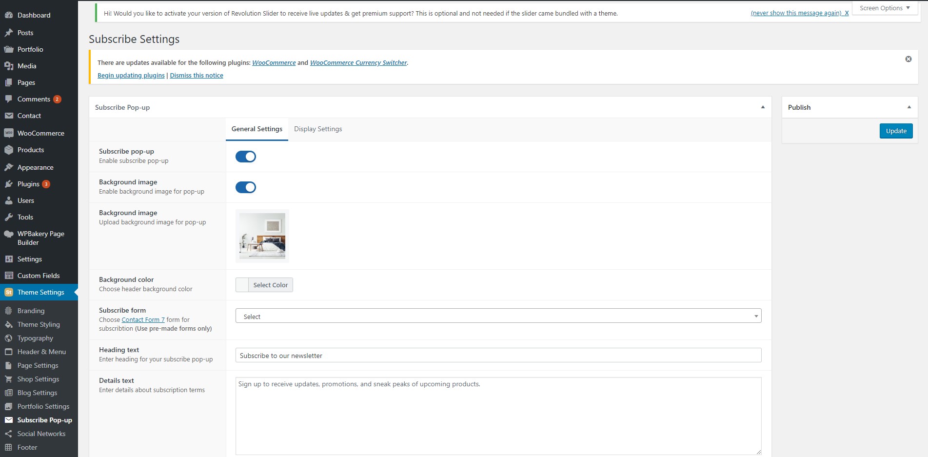
5.9 Subscribe Pop-up #
What is an eCommerce theme without a built-in site-wide subscription pop-up option?
This tab contains two tabs: General Settings, Display Settings.
The General Settings tab allows you to enable/disable the pop-up, set its styling, content and choose the contact form that will be used in it.
The Display Settings tab allows you to choose the condition of display of the pop-up, and its values.
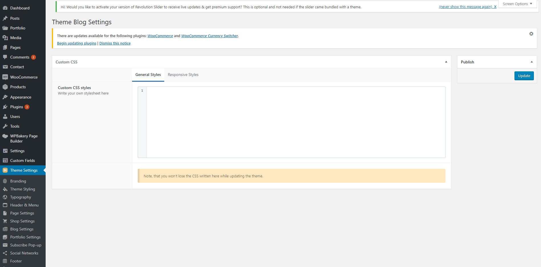
5.12 Custom CSS #
This tab contains the following tabs: General Styles, Responsive Styles.
The General Styles tab allows you to inject CSS into our theme. Any code you put in it will be displayed in the page’s source without any changes, the same way you wrote it.
The Responsive Styles tab is a handy shortcut for multiple rules that you want to apply to a certain type of devices only (mobile, tablet, desktop). Basically it wraps any code put into it in a media query. For instance YOUR_CODE for mobile devices will end up looking like this:
@media screen and (max-width: 768px) {
YOUR_CODE
}
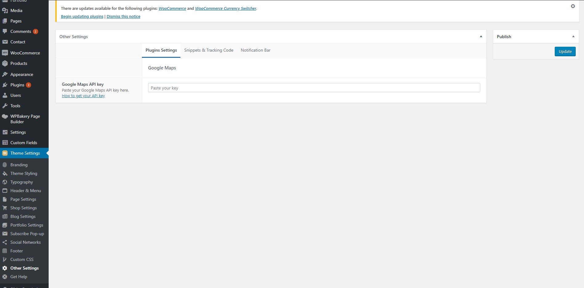
5.13 Other Settings #
This tab contains the following three tabs: Plugins Settings, Snippets & Tracking Code, Notification Bar.
In the Plugins Settings tab you must type in your Google Maps API key to be able to use Google Maps. Without it the Google Maps element will not work, you will see only a grey square on the front-end and get an error in your console.
In the Snippets & Tracking Code tab you can inject JS into your site. For instance you can put your Google Analytics code there.
In the Notification Bar tab you can set up a small button/notification that will be fixed on your site’s pages and will be displayed once in a period you set.
5.10 Social Networks #
This tab contains the following two tabs: Share Bar, Social Networks.
In the Share Bar tab you can enable/disable sharing icons, choose social networks for sharing and set the color of the icons.
The Social Networks tab allows you to create a list of your sharing links.